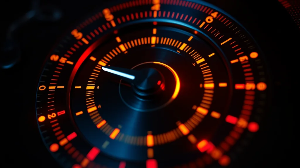
Burnt, neon-looking images usually mean your CFG is too high or your sampler is overcooking. Flat, grey, washed-out images usually mean a missing or wrong VAE. Fix color by loading the correct VAE for your model, keeping CFG in the 4 to 7 range, choosing a clean sampler like DPM++ 2M Karras, and adding light color tags. Most color problems are a two-setting fix.
Color is where a lot of NSFW renders fall apart. You nail the pose and the face, then the skin looks radioactive orange or the whole frame is a lifeless grey wash. Both extremes have specific, known causes, and both are quick to fix once you know which lever to pull. This guide covers oversaturation and washed-out output, with settings tables you can copy. Every example subject is an adult (18+), fictional, and AI-generated, and every prompt carries baseline safety negatives. We are tuning color, not writing explicit content.
You can test color changes live on our generator and see the difference between a good and bad VAE instantly.
The two failure modes
Color problems split into two opposite symptoms, and the fixes are nearly mirror images. Diagnose which one you have first.
| Symptom | Looks like | Most likely cause |
|---|---|---|
| Oversaturated / burnt | Neon skin, blown highlights, heavy contrast | CFG too high, harsh sampler, Pony color quirk |
| Washed out / flat | Grey, low contrast, muddy, dull skin | Missing or wrong VAE, CFG too low |
If you are not sure, generate the same prompt and seed at CFG 4, 7, and 10 side by side. The progression from flat to balanced to burnt will tell you exactly where your sweet spot sits.
Fix 1: load the correct VAE (the washed-out cure)
The VAE (variational autoencoder) is what turns the model latent into the final pixels you see. If it is missing, wrong, or broken, colors go flat, grey, and muddy. This is the number one cause of washed-out NSFW output, and it is the first thing to check.
Some checkpoints have a VAE baked in and need nothing extra. Others ship without one and look terrible until you add the right external VAE.
| Model family | Recommended VAE |
|---|---|
| SDXL / Pony / Illustrious | sdxl-vae (the official SDXL VAE) |
| SD 1.5 realistic | vae-ft-mse-840000-ema-pruned |
| Flux | uses its own built-in VAE |
# In Automatic1111 / Forge:
Settings -> VAE -> SD VAE -> select sdxl_vae.safetensors
# Or set it to Automatic to use the baked-in VAE when present.

# Quick test prompt (adult, fictional, AI subject):
(masterpiece, best quality), 1woman, adult, 29 years old, red dress,
golden hour light, vivid colors, detailed skin
Negative: child, minor, underage, loli, shota, lowres, washed out,
desaturated, bad anatomy, bad hands, watermark
If your image was grey and flat, then snaps to rich color after loading sdxl-vae, the VAE was your problem. A related failure is a fully black or NaN image, which is a different VAE bug covered in our black image fix. The --no-half-vae launch flag prevents that one.
Fix 2: bring CFG into range (the burnt cure)
CFG (classifier-free guidance) controls how hard the model pushes toward your prompt. Crank it too high and the model overshoots: skin glows, highlights blow out, and contrast becomes cartoonish. This is the most common cause of oversaturation.
| CFG value | Result |
|---|---|
| 1 to 3 | Loose, often washed out and soft |
| 4 to 7 | The sweet spot for most NSFW checkpoints |
| 8 to 11 | Punchy, risk of burnt color |
| 12+ | Usually fried, neon, deep-fried look |
For SDXL, Pony, and Illustrious checkpoints, CFG 4 to 6 is the practical home base. Realistic models often look best around 4 to 5. If your output is burnt, drop CFG by 2 and re-render before touching anything else.
# Burnt output? Lower CFG:
CFG: 5    instead of    CFG: 10
Sampler: DPM++ 2M Karras
Steps: 28
If lowering CFG makes the image flat and weak instead, you have over-corrected, so nudge back up by one. The goal is the balanced middle.
Fix 3: choose a clean sampler
Samplers affect color and contrast, not just shape. Some ancestral and SDE samplers add contrast and saturation, which can tip an already-high CFG into burnt territory.
| Sampler | Color behavior |
|---|---|
| DPM++ 2M Karras | Neutral, predictable, safe default |
| Euler a | Slightly softer, gentle color |
| DPM++ SDE Karras | Higher contrast, can oversaturate |
| DDIM | Flat, sometimes useful to tame burnt output |
If you are fighting oversaturation, switch from an SDE sampler to DPM++ 2M Karras and lower CFG together. That pair fixes the large majority of burnt-color complaints. If you want maximum control over color and contrast, DPM++ 2M Karras at moderate CFG is the most boring and most reliable choice, which is exactly what you want here.
Fix 4: the Pony color quirk
Pony-based checkpoints have a well-known tendency toward heavy saturation and contrast, partly because of how they respond to the score tags many people use. If you are on a Pony model and everything looks oversaturated by default, this is expected, and there are specific counters.
Pony-friendly settings to tame color:
CFG: 4 to 5     (lower than you might expect)
Sampler: DPM++ 2M Karras
VAE: sdxl_vae
Add to prompt: natural colors, soft lighting, film grain
Add to negative: oversaturated, neon, hdr, overexposed
The combination of lower CFG, a neutral sampler, and explicit “natural colors” or “soft lighting” tags pulls Pony back to a believable palette. Adding oversaturated and neon to the negative also helps. Our best checkpoints guide notes which Pony merges run hot on color, and the install guide covers loading VAEs alongside them.
Fix 5: color tags in the prompt
You can steer color directly with tags. This is the gentle, artistic layer on top of the technical fixes above.
For richer, controlled color (adult fictional AI subject):
(masterpiece, best quality), 1woman, adult, 31 years old, teal dress,
warm sunset light, vibrant but natural colors, detailed skin texture
Negative: child, minor, underage, loli, shota, oversaturated, neon,
overexposed, washed out, desaturated, bad hands, watermark

For a softer, muted palette:
Add to prompt: muted colors, pastel tones, soft diffused light, low contrast
Tags like “vibrant but natural colors,” “soft lighting,” “golden hour,” or “muted colors” give the model a target. Pair positive color direction with the matching negatives (oversaturated, neon, overexposed, or washed out, desaturated) for the cleanest result. Our prompt formula guide and negative prompt master list both have color-specific entries.
Fix 6: post color correction
Sometimes you have a great composition with imperfect color, and re-rolling is wasteful. Fix it in post. A two-minute curves and saturation pass in any editor can rescue a burnt or flat image.
Quick post fixes:
- Burnt: reduce saturation 10 to 20 percent, pull highlights down,
  add a touch of contrast back if needed.
- Washed out: add contrast via an S-curve, raise saturation slightly,
  set true black and white points.
For an integrated editing workflow that keeps everything in one pipeline, our photo editing workflow guide covers the full process. Post correction is also the right move when only part of the image is off, since you can mask and adjust locally.
Fix 7: check your output color profile and format
A subtle cause of color that looks wrong on screen but fine in the file is a color profile or format mismatch. If your images look oversaturated or shifted only in certain viewers, the issue may be how the image is tagged and displayed rather than the generation itself.
- Save as PNG for editing, high-quality JPG or WebP for sharing. Aggressive JPG compression can shift and band colors, especially in smooth skin gradients.
- Watch sRGB handling. Most generators output sRGB. If a viewer assumes a wider gamut, colors can look oversaturated. Viewing in a color-managed app gives you the truth.
- Avoid double processing. Running an image through multiple auto-enhance steps (generator, then a phone gallery auto-fix, then an upload pipeline) stacks saturation boosts. Each step thinks it is helping and the result is fried.
Clean output habits:
- Keep a PNG master before any compression.
- Disable auto-enhance in your gallery/viewer.
- Do color correction once, deliberately, not via stacked auto-filters.
This matters most when you are publishing or sharing, because the image can look correct in your editor and then get mangled by a platform compression or auto-filter on upload. Keep a clean master and you can always re-export.
Fix 8: when only skin tone is off
Sometimes the overall color is fine but skin specifically looks too orange, too red, or unnaturally smooth and plastic. This is a common NSFW-specific complaint and it has targeted fixes separate from global color.
Skin-tone correction (adult, fictional, AI subject):
Add to prompt: natural skin tone, realistic skin texture, subsurface
scattering, detailed pores, soft shadows
Add to negative: child, minor, underage, loli, shota, orange skin,
plastic skin, oversaturated, waxy, airbrushed, overexposed| Skin problem | Likely cause | Fix |
|---|---|---|
| Too orange | High CFG, warm light tag, Pony bias | Lower CFG, neutral light, natural skin tone tag |
| Plastic / waxy | Heavy model smoothing, no texture tags | Add realistic skin texture, detailed pores |
| Too red / flushed | Overexposed lighting tags | Soften lighting, reduce CFG |
| Grey / lifeless | Missing VAE | Load correct VAE |
The combination of a sane CFG, the right VAE, neutral lighting tags, and explicit skin texture tags produces believable skin. For a full realistic-skin pipeline, our realistic AI guide goes deeper, and the photo editing workflow guide covers local skin-tone correction in post.
Fix 9: a systematic color debugging order
When color is off and you are not sure why, do not change five things at once. Follow this order and change one variable at a time so you learn what actually fixed it.
Color debugging sequence:
1. Is a VAE loaded and correct? (fixes most washed-out cases)
2. Is CFG in the 4 to 7 range? (fixes most burnt cases)
3. Is the sampler neutral (DPM++ 2M Karras)?
4. Are there conflicting light/color tags fighting each other?
5. Is the model a known color-hot Pony merge?
6. Only then, fine-tune with color tags.
7. Last resort, fix in post.
This sequence catches the overwhelming majority of color problems in the first two steps. VAE and CFG together are responsible for most of what people call bad color. Resisting the urge to randomly tweak everything is what gets you to a reliable, repeatable palette instead of a lucky single render you cannot reproduce.
If you keep a small log of which settings produced good color on which checkpoint, you build a personal reference that makes future sessions instant. Color behavior is consistent per model, so once you dial in a checkpoint, those numbers keep working.
A balanced color baseline to copy
Start from this and only change one thing at a time:
VAE: sdxl_vae (for SDXL/Pony/Illustrious)
CFG: 5
Sampler: DPM++ 2M Karras
Steps: 28
Size: 1024x1024

Prompt (adult, fictional, AI subject):
(masterpiece, best quality), 1woman, adult, 30 years old, navy dress,
soft window light, natural skin tone, vibrant but natural colors,
detailed skin texture, sharp focus
Negative: child, minor, underage, loli, shota, oversaturated, neon,
overexposed, washed out, desaturated, lowres, bad anatomy, bad hands,
watermark, jpeg artifacts
The diagnostic order is what saves time. Washed out and grey almost always means VAE first. Burnt and neon almost always means CFG first, then sampler. Once those two are right, color tags fine-tune the palette and post correction handles the last 10 percent. Get the VAE and CFG correct and you will rarely see a bad color image again.
Fix 10: model-specific color behavior
Color is not neutral across model families, and the same CFG produces different results depending on what you load. Knowing each family default saves a lot of trial and error.
| Model family | Color tendency | Best starting CFG |
|---|---|---|
| SD 1.5 realistic | Fairly neutral, can be flat | 4 to 6 |
| SDXL base | Balanced, predictable | 5 to 7 |
| Pony | Runs hot, oversaturates | 4 to 5 |
| Illustrious | Vivid, anime-leaning | 4 to 6 |
| Flux | Natural, low CFG needed | 3 to 4 |
The two extremes to watch are Pony and Flux. Pony leans saturated and wants a lower CFG than feels natural, around 4 to 5, plus the natural-colors tags from Fix 4. Flux is the opposite: it produces clean natural color but only at a low CFG of 3 to 4, and pushing it to 7 like an SDXL model bakes the color hard. If you switch families and your color suddenly looks wrong, your old CFG is probably the culprit, not the prompt. Match CFG to the family first.
Fix 11: common color mistakes to avoid
Most bad-color complaints trace back to a short list of habits. Check yours against this.
Common color mistakes:
- No VAE loaded, then blaming CFG for grey output.
- CFG at 10+ on a model that wants 5.
- Using an SDE sampler at high CFG and getting neon skin.
- Bringing SDXL CFG settings to Flux and burning it.
- Stacking auto-enhance: generator, then gallery, then upload.
- Fighting Pony saturation with tags but never lowering CFG.
- Over-negating color words so the image goes flat and lifeless.| Mistake | Result | Fix |
|---|---|---|
| Missing VAE | Grey, washed out | Load sdxl-vae |
| CFG too high | Burnt, neon | Drop to 4 to 7 |
| SDE sampler + high CFG | Oversaturated | DPM++ 2M Karras |
| Wrong family CFG | Burnt or flat | Match the family |
| Stacked auto-filters | Fried on upload | Keep a clean master |
The single biggest lesson is to change one variable at a time, starting with VAE and CFG. Almost every color problem is one of those two, and the rest of the levers only matter once those are correct. Build a small per-checkpoint settings note and you stop re-solving the same color problem every session.
For the rest of the common problems, from anatomy to blur, our troubleshooting hub links every guide in this cluster, including the blurry image fix which often travels with washed-out color. You can also sanity-check your settings live on our generator before committing to a long batch.
Frequently asked questions
Why are my AI images washed out and grey?
Almost always a missing or wrong VAE. The VAE converts the model latent into final pixels, and without the right one, colors go flat and muddy. Load sdxl-vae for SDXL, Pony, and Illustrious models, or vae-ft-mse-840000 for SD 1.5 realistic models. If grey output snaps to rich color after loading the VAE, that was your problem. A too-low CFG can also flatten color.
Why does my NSFW output look burnt and neon?
Your CFG is probably too high. CFG above 8, and especially above 11, makes the model overshoot, blowing out highlights and frying skin tones. Drop CFG to the 4 to 7 range, with 4 to 6 ideal for most SDXL and Pony checkpoints. If it still looks harsh, switch from an SDE sampler to DPM++ 2M Karras, which is more neutral on color and contrast.
What CFG should I use to avoid color problems?
For most NSFW checkpoints, 4 to 7 is the safe range, and 4 to 6 is often ideal. Realistic models frequently look best around 4 to 5. Below 3 you risk washed-out, weak color, and above 8 you risk burnt, neon output. If unsure, render the same prompt and seed at 4, 7, and 10 to see where your model balances best.
Which VAE should I use for SDXL and Pony?
Use the official sdxl-vae for SDXL, Pony, and Illustrious checkpoints. Some merges bake a VAE in, in which case setting VAE to Automatic works. For SD 1.5 realistic models, use vae-ft-mse-840000-ema-pruned. Flux uses its own built-in VAE and needs nothing extra. If colors are flat, loading the correct external VAE is the first thing to try.
Why does Pony always look so oversaturated?
Pony-based checkpoints lean toward heavy saturation and contrast by design, partly from how they respond to score tags. Counter it with a lower CFG around 4 to 5, the neutral DPM++ 2M Karras sampler, sdxl-vae, and prompt tags like natural colors and soft lighting. Adding oversaturated and neon to your negative prompt also pulls the palette back to something believable.
Does the sampler affect color?
Yes. Some ancestral and SDE samplers add contrast and saturation, which can tip a high CFG into burnt territory. DPM++ 2M Karras is neutral and predictable, making it the safest default for color control. DDIM tends to be flatter, which is occasionally useful for taming an oversaturated model. If you fight burnt color, pair DPM++ 2M Karras with a lower CFG.
Can I fix bad color after generating instead of re-rolling?
Yes, and it is often faster. For burnt images, reduce saturation 10 to 20 percent and pull highlights down. For washed-out images, add an S-curve for contrast, raise saturation slightly, and set proper black and white points. Any editor handles this in two minutes. Post correction is also ideal when only part of the image has a color issue you can mask and adjust.
What color tags help control the palette?
Use vibrant but natural colors, soft lighting, golden hour, or muted colors and pastel tones to steer the look. Pair each positive direction with matching negatives. For rich but controlled color, add oversaturated, neon, and overexposed to the negative. For a flat problem, add washed out and desaturated to the negative. Tags fine-tune the palette once your VAE and CFG are already correct.