To make pinup NSFW AI art, load a realistic checkpoint with a retro or pinup LoRA and prompt with pinup, 1950s, vintage poster, glamour lighting, and halftone texture. Use warm vintage palettes, classic flirty poses, and soft glamour light. Keep all subjects adult, fictional, and AI-generated.
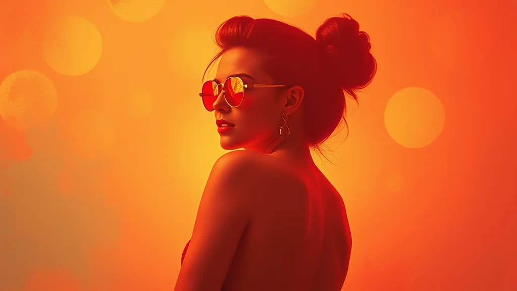
The pinup aesthetic is timeless: warm vintage color, a glamorous adult woman in a classic flirty pose, soft golden lighting, and the printed texture of a 1950s poster. It descends from the mid-century calendar and poster tradition, all confidence and charm rather than explicitness. This guide gets you that retro glamour look, covers the lighting and poses that define it, and gives you copy-paste prompts you can run immediately.
The heart of pinup is the combination of three things: a warm vintage color palette, glamour lighting that flatters with soft shadows and bright key light, and a deliberately classic pose. Get those three right and almost any realistic checkpoint will produce convincing pinup. The style is genre, not a single artist, so we lean on era and technique keywords rather than naming living people.
Best models for pinup style
A realistic SDXL checkpoint is your base. The CyberRealistic, RealVisXL, Juggernaut, and epiCRealism families all render the soft skin and warm light that pinup needs. Pick one from the best NSFW checkpoints list and you are most of the way there with keywords alone.
A retro or pinup-style LoRA sharpens the era feel considerably. Loaded at 0.6 to 0.8, it adds the printed-poster texture, the period color grading, and the painted-illustration quality that defines vintage pinup. The best NSFW LoRAs collection includes retro and vintage options. If you want a painted-pinup look rather than a photographic one, a vintage-illustration LoRA pushes toward the classic calendar-art aesthetic. You can also train your own style LoRA from a set of public-domain era references if you want a very specific decade flavor.
Pony Diffusion works too if you want a stylized or illustrated pinup rather than a photographic one, since it handles painted looks well with a retro LoRA. For photoreal vintage glamour, stick with a realistic checkpoint. On a small card, the low-VRAM guide lists builds that hold the soft glamour rendering on 8GB.
Key prompt keywords for pinup NSFW art
| Keyword | What it does |
|---|---|
| pinup | Master trigger for the genre and posing |
| retro | Reinforces the vintage era feel |
| 1950s | Anchors the specific mid-century decade |
| vintage poster | Adds the printed poster aesthetic |
| classic pinup pose | Triggers the flirty over-the-shoulder posing |
| glamour lighting | Soft flattering key light, the pinup light |
| warm color palette | The golden vintage color grade |
| halftone | Printed dot texture of old posters |
| vintage illustration | Pushes toward painted calendar art |
| gil elvgren style | Genre shorthand for classic painted pinup |
| retro color grading | Faded warm period color |
| 1950s fashion | Period hair, makeup, and wardrobe |
Note on gil elvgren style: use it as a genre label for the classic painted-pinup look, the way you would say “film noir,” not to imitate a specific living artist. It reliably triggers the warm painted calendar-art aesthetic. The load-bearing tags overall are pinup, 1950s or retro, glamour lighting, and warm color palette. Those four define the look.
Lighting and pose tips
Lighting is the soul of pinup. The classic look is glamour lighting: a bright soft key light placed slightly above and to the side, gentle fill so shadows stay soft, and a flattering glow on the skin. In prompt terms that is glamour lighting, soft lighting, warm light, golden hour glow. Avoid hard dramatic shadows or moody low-key lighting, which belong to other styles. Pinup wants the subject brightly and warmly lit, looking radiant.
Poses are equally defining. Classic pinup posing is playful and confident: an over-the-shoulder glance, a hand on the hip, a coy smile, a leg lifted, a back arch. Prompt these directly with classic pinup pose, over the shoulder glance, hand on hip, playful expression, coy smile. The pose should read as charming and self-assured, the signature of the genre. A static front-facing stance does not read as pinup, so always specify a dynamic flirty pose.
Wardrobe and styling complete the era. Period elements like vintage lingerie, retro swimsuit, polka dot, victory rolls hairstyle, red lipstick, 1950s fashion lock the decade. Hair and makeup matter as much as the outfit for selling the era. A warm color grade ties it all together. For settings, a CFG of 5 to 7 and 28 to 32 steps on DPM++ 2M Karras keeps the soft glamour look without over-sharpening, which would break the vintage softness.
Example prompts
A photographic 1950s glamour pinup on a realistic checkpoint with a retro LoRA:
Positive: pinup, retro, 1950s, (glamour lighting:1.1), beautiful adult woman, mature, classic pinup pose, over the shoulder glance, coy smile, red lipstick, victory rolls hairstyle, vintage lingerie, warm color palette, soft lighting, vintage poster
Negative: child, minor, underage, loli, shota, teen, modern, harsh shadows, low key lighting, desaturated, cold colors, 3d, anime, cartoon, blurry, deformed, bad hands, watermark, lowres
A painted calendar-art pinup leaning into the illustrated tradition:
Positive: pinup, vintage illustration, gil elvgren style, painted, 1950s, adult woman, playful pose, hand on hip, glamour lighting, warm vintage colors, halftone texture, retro poster, charming expression
Negative: child, minor, underage, loli, shota, teen, photograph, realistic skin, modern clothing, cold lighting, dark, gritty, anime, cartoon, deformed, extra fingers, watermark, lowres
A retro swimsuit beach pinup with bright warm light:
Positive: pinup, retro, 1950s, adult woman, mature, retro swimsuit, polka dot, beach background, sunny, golden hour glow, glamour lighting, playful expression, classic pinup pose, warm color grading, vintage poster style
Negative: child, minor, underage, loli, shota, teen, young girl, harsh shadow, overcast, desaturated, modern, 3d render, anime, blurry, bad anatomy, watermark, lowres
Load any of these into our free NSFW generator and adjust the glamour lighting weight and palette to taste.
Pinup sub-styles across the decades
Pinup is not a single era look, and steering between decades gives variety. The 1940s wartime pinup leans on 1940s, victory rolls, high waisted, sepia tones, classic glamour. The 1950s calendar-art peak uses 1950s, vintage poster, polka dot, halftone, warm color palette. The 1960s mod pinup brightens up with 1960s, mod fashion, bright pastels, bouffant hairstyle. A rockabilly alt-pinup look bridges toward edgier styling with rockabilly, tattoos, retro, bandana, bold red lips.
The decade you target changes hair, makeup, wardrobe, and color grade together, so anchor the decade tag and let the styling follow. Victory rolls and sepia read 1940s; polka dots and bright warm color read 1950s; mod patterns and pastels read 1960s. Consistency across these elements is what makes the era convincing rather than a vague vintage gesture.
Photographic versus painted pinup
There are two distinct pinup traditions and they need different prompts. Photographic pinup imitates a vintage glamour photo shoot: use a realistic checkpoint with photograph, glamour lighting, vintage photo, film grain, warm tones. Painted pinup imitates the classic calendar-art illustration tradition: use vintage illustration, painted, gil elvgren style, smooth airbrush, halftone as a genre reference, not an artist imitation.
The painted route is more forgiving of anatomy quirks because the illustrated look hides them, while the photographic route demands clean skin and hands like any photoreal work. Decide which tradition you want before you prompt, because mixing photograph and painted produces a confused hybrid that reads as neither. For the painted look, Pony handles illustration well; for the photographic look, stick with a realistic checkpoint.
Building the warm vintage palette
Color grade is what makes a modern render read as a period piece. The pinup palette is warm and slightly faded: golden highlights, soft reds and pinks, creamy skin tones, muted teal or pastel accents. Prompt it with warm color palette, retro color grading, faded colors, vintage tones. Avoid cool blue-heavy or high-contrast modern color, which instantly breaks the era. If a render looks too crisp and contemporary, add faded, vintage tones and reduce any sharpening.
The halftone and vintage poster tags add the printed texture of old posters and calendars, the visible dot pattern and slight print imperfection that screams mid-century. Use them when you want the printed-artifact look rather than a clean photo. For a painted feel, lean on vintage illustration and painted instead, which give brushwork rather than print dots.
Wardrobe and styling deep dive
Pinup wardrobe is half the genre, and getting the period details right is what sells the era. Classic pinup wardrobe includes retro swimsuit, vintage lingerie, polka dot dress, high waisted bottoms, garter belt, seamed stockings, pencil skirt. These pieces instantly signal mid-century glamour. Pair them with period accessories: cat eye glasses, pearl necklace, silk gloves, vintage heels, headscarf. The accessories carry as much era information as the main garment.
Hair and makeup complete the styling and are non-negotiable for a convincing pinup. The signature hairstyles are victory rolls, vintage curls, finger waves, bouffant, and the makeup is red lipstick, winged eyeliner, defined brows, classic glamour makeup. A modern hairstyle or natural makeup instantly breaks the era no matter how good the wardrobe is, so always specify period hair and makeup explicitly. These details are the difference between a costume and a believable vintage subject.
Color grading ties the styling together. Even with perfect wardrobe, a cold modern color grade ruins the effect. Always anchor warm tones, retro color grading, golden glow so the whole image reads as a period piece. The warm grade is what makes the wardrobe, hair, and lighting feel like they belong to the same vintage moment rather than a modern shoot in retro clothes.
Lighting setups that flatter
Pinup lighting is a craft worth learning a little theory for, because the right setup is what makes the subject glow. The classic glamour setup is a large soft key light placed high and slightly to one side, a gentle fill to keep shadows soft, and a subtle hair light to separate the subject from the background. In prompt terms that translates to glamour lighting, soft key light, soft fill light, hair light, warm rim light. The goal is flattering, even, warm illumination with no harsh shadows.
A second flattering setup is the golden-hour or window-light look, prompted with warm window light, golden hour glow, soft directional light. This gives a softer, more candid vintage feel that still flatters. Avoid hard direct light or strong single-source shadows, which read dramatic and modern rather than glamorous. The whole point of pinup lighting is to make the subject look radiant and idealized, which means soft and warm above all else. When a pinup falls flat, lighting is usually the culprit, so reach for these setups first before changing anything else.
Worked example: from generic to genuine pinup
Start with the photographic prompt above. A common first-pass problem is that the image looks like a modern glamour photo, not vintage. Fix it in layers. First, strengthen the era anchors: raise emphasis on 1950s and add retro color grading, faded colors. Second, lock the pose: if the subject is standing flat, add classic pinup pose, over the shoulder glance, hand on hip. Third, add period styling: victory rolls hairstyle, red lipstick, vintage lingerie. Each layer pushes the render further into the era.
If the lighting looks flat or harsh, that is the most common reason a pinup fails. Add glamour lighting, soft key light, warm light and negate harsh shadows, low key lighting. Once the look is right, finish with a gentle face detailer and a soft upscale. Avoid aggressive sharpening, which fights the vintage softness. Learn how to add detail without over-crisping, and pick an upscaler setting that preserves the warm grain rather than scrubbing it clean.
Negative prompts for authentic pinup
The negative prompt keeps a pinup looking vintage rather than modern. A strong pinup negative blocks contemporary cues and the wrong lighting: modern, contemporary, harsh shadows, low key lighting, cold colors, desaturated, blue tones, gritty, dark, 3d render, anime, cartoon, blurry, bad hands, deformed, watermark, lowres. Always carry the age safety tokens child, minor, underage, loli, shota, teen as well, since they are mandatory on every image.
The key style negations are modern, contemporary, cold colors, harsh shadows. These four actively pull the render toward the warm, soft, period look and away from a modern glamour photo. If your pinup keeps looking like a contemporary shoot, strengthen these negations and reinforce the era anchors in the positive. The negative prompt master list has more options to refine the look.
You can also negate dull, flat lighting to ensure the glamour lighting reads as soft and flattering rather than flat. Pinup depends on that bright warm key light, so blocking flat or dull lighting in the negative helps the soft glamour glow come through. Combined with glamour lighting in the positive, this gives the radiant vintage finish the genre is known for, and it is the single most common fix when a pinup looks lifeless.
Common mistakes
The biggest mistake is modern lighting. Hard, cool, high-contrast light instantly reads as a contemporary photo, not pinup. Always use glamour lighting and a warm palette. The second is a static pose. Pinup is defined by playful, confident posing, so a flat front-facing stance never sells the genre. The third is forgetting the era styling, which is hair, makeup, and wardrobe. Those details carry as much era information as the color grade.
The fourth, as always, is age discipline. Keep adult woman, mature anchored and child, minor, underage, loli, shota, teen in every negative. Pinup celebrates a confident grown woman, and your tags must make that unambiguous. For more on style selection, the pillar best NSFW AI art styles compares pinup against the other looks. When you are ready, generate a pinup image free with the prompts above and save your best era-anchor stack as a reusable template.
Quick-start checklist for pinup art
For an authentic vintage pinup fast, run this checklist. First, load a realistic checkpoint with a retro LoRA at 0.7, or Pony with a retro LoRA for a painted look. Second, build the positive around pinup, 1950s, glamour lighting, warm color palette, classic pinup pose plus period hair, makeup, and wardrobe. Third, set CFG to 6 and steps to 30 on DPM++ 2M Karras. Fourth, apply the anti-modern negative plus the age safety tokens. Fifth, specify a flirty confident pose, never a flat stance. Sixth, finish with a gentle face detailer and a soft upscale that preserves warm grain.
Follow that sequence and the era reads convincingly. The modern drift is blocked by the negative and the era anchors, the glamour glow comes from the lighting tags and the anti-flat negation, and the soft finish keeps the vintage character intact. Save the stack as a template so each new pinup starts from a proven base, then swap only the decade, wardrobe, and pose to produce a varied vintage set. The combination of warm lighting, period styling, and a confident pose is the whole genre, and once those are locked into a template the look reproduces reliably. Ready to try it? Generate a pinup image free with the checklist above.
Frequently asked questions
Which model is best for pinup NSFW AI art?
A realistic SDXL checkpoint from the CyberRealistic, RealVisXL, Juggernaut, or epiCRealism families gives the soft skin and warm light pinup needs. Add a retro or pinup LoRA at weight 0.6 to 0.8 for the printed-poster texture and period color. Use Pony with a retro LoRA if you want a painted illustrated pinup instead.
What lighting makes a pinup image look authentic?
Glamour lighting is the key: a bright soft key light placed slightly above and to the side, gentle fill so shadows stay soft, and a warm glow on the skin. Prompt glamour lighting, soft lighting, and warm light, and avoid hard or low-key shadows, which break the radiant vintage look.
How do I get the 1950s vintage color palette?
Use warm color palette, retro color grading, faded colors, and vintage tones in the prompt. The pinup palette is warm and slightly faded with golden highlights and creamy skin tones. Avoid cool blue-heavy or high-contrast modern color, which instantly makes a render read as contemporary rather than period.
Is it okay to use gil elvgren style in prompts?
Use it as a genre label for the classic painted-pinup look, the way you would say film noir, not to imitate a specific living artist. It reliably triggers the warm painted calendar-art aesthetic. Pair it with vintage illustration and painted for the illustrated tradition rather than a photo.
What poses define pinup style?
Classic pinup posing is playful and confident: an over-the-shoulder glance, a hand on the hip, a coy smile, a leg lifted, or a back arch. Prompt classic pinup pose, over the shoulder glance, and hand on hip. A static front-facing stance does not read as pinup, so always specify a dynamic flirty pose.
How do I add the printed poster texture?
Use halftone and vintage poster in the prompt to add the visible dot pattern and slight print imperfection of mid-century posters and calendars. For a painted feel instead of print, use vintage illustration and painted, which give brushwork rather than halftone dots. Choose based on whether you want photo, print, or paint.
What CFG and steps work for pinup style?
A CFG of 5 to 7 with 28 to 32 steps on DPM++ 2M Karras keeps the soft glamour look without over-sharpening, which would break the vintage softness. Keep finishing gentle too: a light face detailer and a soft upscale that preserves warm grain rather than scrubbing the image clean.
How do I keep pinup subjects clearly adult?
Anchor adult woman and mature in the positive prompt and keep child, minor, underage, loli, shota, and teen in every negative. Pinup celebrates a confident grown woman, and the period styling and posing should reinforce maturity. Discard and re-prompt any image that reads even slightly young.