To make cartoon NSFW AI art, load Pony with a toon LoRA or a western-cartoon checkpoint and prompt with cartoon, toon, cel shading, thick lineart, and flat color. This western style uses bold outlines and flat color, unlike anime. Always anchor an adult woman so the subject reads clearly 18 plus. Keep all subjects adult, fictional, and AI-generated.
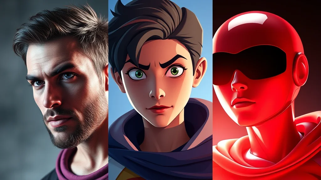
Western cartoon is one of the most distinctive NSFW styles and one of the most misunderstood, because people lump it in with anime. They are not the same. Western cartoon means bold black outlines, flat color blocks, simple cel shading, and the proportions of an adult animated series. Think the look of a mature western cartoon, not Japanese illustration. This guide gets you that specific toon aesthetic, keeps it clean and adult, and gives you copy-paste prompts.
First, the critical distinction. Anime uses soft gradient shading, big detailed eyes, and a particular face geometry. Western cartoon uses thick uniform outlines, flat or two-tone color, simplified features, and bolder shapes. If your output has glossy anime eyes and soft shading, you have drifted into anime and need to push your tags harder toward western cartoon style, thick lineart, flat color. Getting this separation right is the whole skill.
Western cartoon versus anime
It is worth being explicit because the models blur the line constantly. Western cartoon: bold outlines of even thickness, flat color fills, minimal gradient, cel shading limited to one or two tones, expressive but simplified faces, exaggerated but adult body proportions. Anime: thinner variable linework, smooth gradient shading, large reflective eyes, detailed hair rendering, and a distinct stylized face. When you prompt cartoon, the model will lean anime unless you actively counter it, so your negative prompt should include anime, manga when you want pure western toon.
If anime is actually what you want, that is a different recipe entirely and you should use Illustrious models with Danbooru tags. This guide is strictly the western toon look.
Best models for cartoon style
Pony Diffusion is the best foundation. It handles stylized output cleanly, has reliable anatomy, and responds well to toon LoRAs and style score tags. Stack a western-cartoon or toon-style LoRA at weight 0.7 to 0.9 and you get committed flat-color output. Pony is my default for this style.
The second option is a dedicated cartoon-style checkpoint. Several SDXL merges are tuned specifically for thick-line flat-color output and need almost no extra tagging to land the look. Browse the best NSFW checkpoints list for cartoon-leaning merges. If you want a very specific show-style look that no checkpoint matches, train a style LoRA on a set of reference frames. The best NSFW LoRAs collection also has ready-made toon options.
Good news for budget rigs: cartoon style is forgiving on hardware because flat color and simple shading are easy to render. The low-VRAM checkpoint guide covers builds that handle toon work smoothly on 8GB.
Key prompt keywords for cartoon NSFW art
| Keyword | What it does |
|---|---|
| cartoon | Master trigger, but leans anime alone |
| western cartoon style | Pushes specifically toward western toon |
| toon | Reinforces the flat stylized look |
| cel shading | One or two tone shading, the toon shadow style |
| thick lineart | Bold even outlines, the defining toon feature |
| bold outlines | Reinforces strong black linework |
| flat color | Solid color fills with minimal gradient |
| flat shading | Removes soft gradients, keeps it graphic |
| simple shading | Limits shadow complexity |
| vibrant colors | Punchy saturated toon palette |
| adult animation style | Mature western cartoon framing |
The load-bearing tags are thick lineart, flat color, and western cartoon style. Those three are what separate toon from anime and from a soft illustration. Add cel shading for that animated-frame shadow look. Keep the cluster tight at four or five tags so the sampler commits cleanly.
Keeping cartoon NSFW art clearly adult
This is the most important section in the guide and it is not optional. Stylized cartoon art simplifies features, and simplification can make a subject read younger than intended. You must actively prevent this. Every cartoon image must depict a subject that unambiguously reads as an adult woman. That means mature proportions, an adult face, and explicit adult anchoring in the prompt.
Concretely: always include adult woman, mature, busty or similar adult-body anchors in the positive prompt, and always keep child, minor, underage, loli, shota, teen, young girl in the negative prompt. Cel shading and simplified features remove detail, so the age signal has to come from your tags and from body proportions. If a generated cartoon image reads even slightly young, discard it and re-prompt with stronger adult anchors. There is no gray area here. A stylized cartoon subject must read as a grown adult, never childlike, full stop.
This is both an ethical line and a legal one. Build the adult anchors and the full negative into your saved template so you never ship a cartoon image without them. The simplification that makes toon art appealing is exactly why the age discipline has to be tighter here than in photoreal work.
Example prompts
A clean western cartoon starting point on Pony with a toon LoRA:
Positive: western cartoon style, (thick lineart:1.2), cel shading, flat color, adult woman, mature, busty, confident expression, vibrant colors, simple background, bold outlines
Negative: child, minor, underage, loli, shota, teen, young girl, anime, manga, realistic, photograph, 3d, soft shading, gradient, blurry, deformed, bad hands, watermark, lowres
A punchier adult-animation look with stronger graphic flatness:
Positive: adult animation style, western cartoon, bold outlines, flat shading, (flat color:1.2), adult woman, curvy, playful pose, saturated colors, clean lineart, studio background
Negative: child, minor, underage, loli, shota, teen, anime eyes, manga, photorealistic, 3d render, soft gradient, painterly, realistic skin, deformed, extra fingers, watermark, lowres
A softer toon-illustration variant that keeps thick lines but warmer color:
Positive: cartoon, western cartoon style, thick lineart, cel shading, adult woman, mature, warm color palette, expressive face, dynamic pose, simple shading, vibrant
Negative: child, minor, underage, loli, shota, young, anime, manga, photo, 3d, realistic, gritty texture, blurry, bad anatomy, watermark, lowres
Drop any of these into our free NSFW generator and tweak the lineart and color weights to dial the toon strength up or down.
Lighting, color, and composition
Cartoon style is about graphic clarity, not realistic light. Lighting is simplified into flat fills with one or two shadow tones from cel shading. You generally do not want cinematic or volumetric lighting tags here, because they pull the render toward realism and break the flat look. Keep it simple: even lighting, clean shadows.
Color is a defining feature. Vibrant colors and saturated colors give the punchy toon palette, while flat color keeps fills solid. If you want a moodier cartoon, use warm color palette or muted colors but keep the flatness. Backgrounds should be simple. A simple background, solid color background, or clean studio backdrop keeps the focus on the subject and reads as a deliberate cartoon rather than a busy scene. Detailed photographic backgrounds fight the toon aesthetic.
For settings, cartoon is forgiving. A CFG of 6 to 8 works, with 25 to 30 steps on Euler a or DPM++ 2M Karras. Because flat color hides micro-detail, you can often skip aggressive detailing, though a face pass still helps the eyes. Generate at standard SDXL portrait resolutions and upscale if you want print-clean lines.
Cartoon sub-styles and show looks
Western cartoon is a broad family, and you can steer toward specific show aesthetics with tag tweaks. The classic prime-time adult-animation look uses adult animation style, thick lineart, flat color, simple shading. A modern flat-design cartoon look (cleaner, more geometric) uses flat design, minimal shading, bold color blocks, clean lineart. A retro rubber-hose or vintage cartoon look uses vintage cartoon, rubber hose style, bold outlines while keeping the subject adult. A comic-adjacent cartoon with more shading bridges toward comic style via cel shading, halftone, bold shadows.
The lever between these is shading complexity and line weight. Flatter shading and bolder lines read more modern and graphic; added halftone and shadow reads more comic. Decide where on that spectrum you want to sit and tag accordingly. Staying consistent within one sub-style across a set of images is what makes a cohesive cartoon series rather than a grab bag.
Settings and finishing for cartoon work
Cartoon is the most forgiving style on hardware and settings, but a few choices sharpen the result. Use a CFG of 6 to 8: high enough to commit to the flat graphic look, not so high that colors blow out. Stick to 25 to 30 steps on Euler a or DPM++ 2M Karras. Flat color means you can generate at slightly lower resolution and upscale cleanly, since there is little micro-texture to preserve.
For finishing, the priority is clean linework. Run a face detailer to sharpen the eyes and mouth, which carry the expression in a simplified face. Then upscale with a model that preserves hard edges rather than smoothing them, because a soft upscaler turns crisp toon lines into mush. Learn how to add detail for the face pass and pick an upscaler tuned for line art. A properly finished cartoon image has razor-clean outlines and flat even color, which is exactly the professional toon look.
Worked example: dialing in the toon look
Start with the base Pony cartoon prompt. If the first pass comes out looking like anime (glossy eyes, soft shading), do three things. First, raise thick lineart to 1.3 and add bold outlines. Second, add anime, manga, soft shading to the negative prompt to actively push away from the anime lean. Third, add flat color emphasized to 1.2 to kill gradients. That combination forces the western toon look.
If the subject reads too young, stop and fix it before anything else. Add mature, adult woman, busty and strengthen the negative with teen, young girl, loli. Regenerate until the subject unambiguously reads adult. Only then move on to polish. For final cleanup, run a face detailer to sharpen the eyes and mouth, then a light upscale to keep the lines crisp. Learn how to add detail and which upscaler preserves clean linework rather than blurring it.
Expression, pose, and personality
Cartoon style lives on exaggeration and personality, which is part of its appeal. Because features are simplified, expression carries the image. Lean into bold clear expressions: confident expression, playful smirk, winking, sultry look, exaggerated expression. A flat neutral face reads as unfinished in cartoon style, so always give the subject a clear emotion. The simplified features make strong expressions read instantly, which is exactly what makes good cartoon art pop.
Posing follows the same logic. Cartoon supports dynamic, exaggerated poses that would look stiff in photoreal: dynamic pose, exaggerated pose, hand on hip, playful stance, confident posture. The bold linework and flat color flatter strong silhouettes, so think in terms of a clear readable shape. A cartoon figure should read as a strong silhouette even in pure black, which is the test animators use. Compose for that and the image gains energy.
Color choices reinforce personality. A bright saturated palette reads upbeat and playful, while a muted color palette or limited color palette reads moodier and more stylish. Pick the palette to match the personality you want, and keep it consistent across a set so the cartoon series feels intentional. The combination of clear expression, strong pose, and deliberate palette is what separates a flat lifeless cartoon from a vivid one.
Negative prompts for clean cartoon output
The negative prompt is your main tool for keeping cartoon from drifting into anime or realism. A strong cartoon negative blocks the wrong styles and the usual artifacts: anime, manga, soft shading, gradient, realistic, photograph, photorealistic, 3d render, painterly, blurry, sketchy lines, deformed, bad hands, extra fingers, watermark, lowres. On top of that, always carry the age safety tokens child, minor, underage, loli, shota, teen, young girl, which are non-negotiable for stylized work.
The most important style negations here are anime, manga, soft shading, gradient. These four actively push the output toward flat western toon and away from the anime default that models fall into. If your cartoon keeps coming out anime, strengthen these negations before touching anything else. The negative prompt master list covers more options, and the prompt formula guide explains how to balance positive and negative weights.
You can also negate sketchy lines, rough lineart to keep the bold clean outlines that define the toon look. Cartoon depends on crisp even linework, so blocking sketchy or broken lines in the negative helps the model commit to clean bold outlines. Combined with thick lineart in the positive, this gives the professional flat-color toon finish you are aiming for.

Common mistakes
The number one mistake is letting cartoon drift into anime. Counter it with western cartoon style, thick lineart, flat color in the positive and anime, manga in the negative. The second is over-detailing. Adding realistic skin, cinematic lighting, or heavy texture breaks the flat toon look. Keep it graphic. The third, and the one that matters most, is failing to keep the subject clearly adult. Stylization simplifies features, so adult anchoring and the full age negative are mandatory on every single cartoon image. Never skip it.
The fourth mistake is a cluttered background that competes with the flat subject. Keep backgrounds simple. If you want to see how cartoon compares to other stylized routes, the pillar best NSFW AI art styles lays them all out side by side. When you are ready, generate a cartoon image free with the prompts above and lock your template once the toon look and the adult anchoring are both solid.
Quick-start checklist for cartoon art
For fast clean western cartoon output, run this checklist. First, load Pony with a toon LoRA at 0.8 or a cartoon-style checkpoint. Second, build the positive around western cartoon style, thick lineart, cel shading, flat color plus your adult-anchor tags. Third, set CFG to 7 and steps to 28 on Euler a. Fourth, apply the anti-anime negative plus the full age safety tokens. Fifth, anchor a clear expression and dynamic pose. Sixth, run a face detailer then a line-preserving upscale.
Follow that order and the toon look lands consistently. The anime drift is blocked by the negative plus thick-lineart and flat-color anchors, the subject stays clearly adult through the anchor and safety tokens, and the lines stay crisp through the right upscaler. Save the stack as a template so each new cartoon starts from a proven base. With the template locked, you only swap subject, pose, and expression, which keeps a cartoon series visually consistent. The simplification that makes cartoon appealing is also what makes the age discipline non-negotiable, so never ship a cartoon without confirming the subject reads clearly adult. Ready to try it? Generate a cartoon image free with the checklist above.
Frequently asked questions
What is the difference between cartoon and anime NSFW AI art?
Western cartoon uses bold even outlines, flat color fills, and simplified cel shading, while anime uses thinner variable linework, soft gradient shading, and large detailed eyes. Models lean anime by default, so you must add western cartoon style, thick lineart, and flat color while negating anime and manga to get true toon output.
Which model is best for western cartoon NSFW art?
Pony Diffusion with a toon-style LoRA at weight 0.7 to 0.9 is the best foundation, giving committed flat-color output with reliable anatomy. Dedicated cartoon-style SDXL checkpoints also work with minimal tagging. Choose Pony if you want the most flexible base with a toon LoRA on top.
How do I keep cartoon NSFW art clearly adult?
Always anchor adult woman, mature, and busty in the positive prompt and keep child, minor, underage, loli, shota, teen, and young girl in the negative. Cel shading simplifies features, so the age signal must come from your tags and adult body proportions. Discard and re-prompt any image that reads even slightly young.
Why does my cartoon prompt keep producing anime?
Cartoon alone leans anime because of training data. Raise thick lineart to 1.3, add bold outlines and flat color, and put anime, manga, and soft shading in the negative prompt. That combination actively pushes the output toward western toon and away from the anime default.
What keywords define the western cartoon look?
The load-bearing tags are western cartoon style, thick lineart, and flat color, plus cel shading for animated-frame shadows. These three separate toon from both anime and soft illustration. Keep the cluster tight at four or five tags so the sampler commits cleanly to the flat graphic style.
Do I need cinematic lighting for cartoon art?
No, and you should avoid it. Cartoon style uses simplified flat lighting with one or two shadow tones from cel shading. Cinematic or volumetric lighting tags pull the render toward realism and break the flat toon look. Keep lighting even and shadows clean for a proper cartoon aesthetic.
What CFG and steps work for cartoon style?
A CFG of 6 to 8 with 25 to 30 steps on Euler a or DPM++ 2M Karras works well. Cartoon is forgiving because flat color hides micro-detail. You can often skip aggressive detailing, though a face pass still helps sharpen the eyes and mouth before a final upscale.
Should I upscale cartoon NSFW images?
Yes if you want print-clean lines. Run a face detailer to sharpen the eyes and mouth, then a light upscale with a model that preserves clean linework rather than blurring it. Flat color upscales easily, so the main goal is keeping outlines crisp at full resolution.