To make lineart NSFW AI art, prompt lineart, line art, clean lineart, monochrome, black and white, ink drawing, clean outlines, no color, white background on an Illustrious or Pony base, add a lineart LoRA or ControlNet lineart pass, ban color with colored, painting, shading, greyscale render in the negatives, and keep CFG moderate so the lines stay crisp and unbroken.
What the lineart look actually is
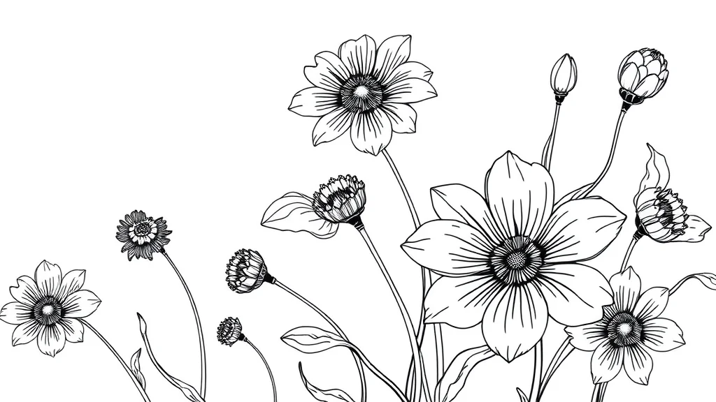
Lineart is the drawing reduced to its lines. Clean black ink outlines on a white background, with little or no color and often no shading beyond hatching. It covers a range: crisp manga inking, a loose graphite pencil sketch, a coloring-book style clean outline, or a cross-hatched pen-and-ink illustration. The common thread is that line does the work, not color and not rendered volume.
This is distinct from comic style. A comic-style image is a full paneled, colored, rendered comic page. Lineart is the ink stage before color, or a deliberate finished piece that stays monochrome. The whole aesthetic depends on clean, confident, unbroken lines and the restraint of leaving color out.
The core challenge is that diffusion models desperately want to add color and shading. They are trained on finished, rendered, colored images. Asking for pure black-on-white lineart means fighting that default hard, and the second challenge is line integrity: models produce doubled, broken, or wobbling lines unless you steer them.
There is a real payoff for getting it right, though. Clean lineart is the most versatile asset you can make, because it is the base layer for everything else. A single good lineart drawing can be colored a dozen different ways, turned into a cel-shaded piece, printed as a coloring page, or used as a ControlNet guide to lock a pose across a whole set of images. So the effort you put into clean, confident linework pays back every time you reuse it, which is why it is worth learning to control properly rather than treating it as a quick sketch you throw away.
The visual fingerprints to aim for
- Clean black ink or pencil lines on a white or near-white background
- Little or no color, or a single flat accent at most
- Confident unbroken outlines, no wobble or doubling
- Optional cross-hatching or graphite shading for volume
- A drawing, not a render: no gradients, no photoreal skin
The three main lineart flavors
It helps to decide which flavor you are making before you prompt, because the tags differ. Manga inking is crisp black ink with bold varied line weight and often heavy spot blacks and cross-hatching, the finished look of a printed manga page. Coloring-book lineart is clean, even, uniform outline with almost no interior shading, wide open shapes ready to be filled. Graphite sketch is softer and grainier, drawn with pencil, with visible construction lines and loose gestural energy rather than clean ink. All three are lineart, but manga wants bold ink, spot blacks, cross hatching, coloring-book wants clean even outline, minimal detail, open shapes, and graphite wants pencil sketch, soft graphite, construction lines, rough sketch. Naming the flavor up front gets you a far more coherent result than a generic request.
Best checkpoints and LoRAs for lineart
Anime-leaning bases handle lineart best because their training includes manga inking. Pair with a lineart LoRA or a lineart ControlNet.
| Pick | Base model | Why it works for lineart |
|---|---|---|
| Illustrious anime finetune | Illustrious (SDXL) | Strong native line quality, understands manga inking |
| Pony diffusion finetune | SDXL/Pony | Good NSFW range plus solid outline rendering |
| WAI Illustrious | Illustrious | Clean anatomy that translates to clean outlines |
| SDXL base + lineart LoRA | SDXL | Neutral canvas, LoRA forces the monochrome ink look |
| Lineart / manga inking LoRA | Illustrious or SDXL | Pushes pure black-on-white, kills residual color |
Run a lineart or manga-inking LoRA at 0.7 to 0.9, this style tolerates higher LoRA weight than painterly styles because you want it to dominate. See our Pony diffusion guide, best Illustrious NSFW checkpoints, and best NSFW LoRAs.
The prompt: copy-paste positive tags
Front-load the medium and the no-color instruction. Repetition of the monochrome idea helps here.
lineart, line art, clean lineart, monochrome, black and white,
ink drawing, pen and ink, clean outlines, crisp linework, no color,
white background, manga inking style, sketch, uncolored, lineart only,
(adult woman:1.15), original character, elegant pose, detailed linework,
confident lines, minimal shading, cross hatching, coloring book style
Load-bearing tokens:
lineart, line art, clean lineartstacked repetition pushes the medium hard.monochrome, black and white, no color, uncoloredfight the color default from four angles.white backgroundkeeps it clean and print-ready.clean outlines, crisp linework, confident linesprotect line integrity.cross hatching, minimal shadinggive volume without breaking the ink look.
For a pencil-sketch variant, swap ink drawing, pen and ink for graphite pencil sketch, pencil drawing, sketchbook. Our prompt formula guide covers token ordering.
Negative prompt for lineart
This is a color-suppression job first, line-quality second.
color, colored, colorful, painting, digital painting, rendered, shading,
soft shading, gradient, greyscale render, photorealistic, photo, 3d,
watercolor, oil painting, cel shading, doubled lines, broken lines,
sketchy mess, messy lines, wobbly lines, blurry, smudged,
bad anatomy, extra fingers, deformed hands, watermark, signature, text
Key entries: color, colored, colorful, painting, rendered are the anti-color stack, the most important part. doubled lines, broken lines, wobbly lines target the specific line-integrity failures. greyscale render stops it giving you a fully shaded grey painting instead of clean lineart. Extend from our negative prompts master list.
Settings: sampler, CFG, steps, resolution
Lineart wants crisp, so a clean sampler and moderate CFG. Too high and lines double, too low and they go soft.
| Setting | Value | Why |
|---|---|---|
| Sampler | Euler a or DPM++ 2M Karras | Crisp line rendering |
| CFG scale | 5 to 7 | Enough to hold monochrome, not so high lines double |
| Steps | 24 to 30 | Lineart resolves fast, extra steps add color noise |
| Base resolution | 896×1152 or 832×1216 | Portrait, native aspect |
| Hires fix | 1.5x, denoise 0.25 | Sharpen lines without adding color |
| ControlNet | lineart preprocessor, weight 0.6 to 0.9 | Locks clean line structure from a reference |
Keep hires denoise very low, a higher pass will start coloring the image in. Our CFG and sampler settings guide has the full behavior notes.
Step-by-step workflow
- Load an Illustrious or Pony anime checkpoint, add a lineart LoRA at 0.8.
- Paste the positive block with your original adult character tags and the full negative block.
- Set Euler a, CFG 6, 26 steps, 896×1152.
- Batch 6 images. Line quality varies by seed, so generate volume and pick the cleanest, least-doubled lines.
- If you have a pose reference or a finished color image you want the lineart of, run ControlNet with the lineart preprocessor at 0.7. This is the most reliable way to get clean, intentional linework. Our ControlNet guide covers the lineart preprocessor.
- Reject any render that colored itself in or doubled the outlines early.
- For broken or doubled lines in one area, inpaint that region with
clean lineart, single clean outline, no colorat 0.5 denoise. See the inpainting guide. - Run ADetailer on the face at 0.25 denoise with the lineart tags so the fixed face stays uncolored line drawing, not a rendered face.
- Optional: a light hires-fix pass at 0.25 denoise to crisp the lines. Do not go higher or it colors in.
Step 5 is the pro move. If you want lineart of a specific pose or an existing image, the lineart ControlNet preprocessor extracts clean edges and forces the generation to follow them, which sidesteps the wobbly-line lottery entirely. For pure txt2img lineart, the stacked monochrome tokens plus a lineart LoRA do most of the work.

Where lineart breaks, and the fix
Two failure families dominate: accidental color and broken lines.
| Symptom | Cause | Fix |
|---|---|---|
| Image came out colored | Anti-color negatives too weak | Add color, colored, painting, rendered weight, stack no color, monochrome in positive |
| Faint grey shading everywhere | Model rendered greyscale volume | Add greyscale render, soft shading, gradient to negatives, add flat, minimal shading |
| Doubled or tripled outlines | CFG too high or messy seed | Lower CFG to 5, add doubled lines negative, inpaint the region |
| Broken, gappy lines | Under-resolved or too few steps | Raise steps to 30, add clean unbroken lines, confident lines |
| Wobbly amateur linework | No line structure guidance | Use ControlNet lineart at 0.7 from a clean reference |
| Background not white | White-bg token buried | Move white background earlier, add simple white background |
| Lines too thin and weak | Ink weight low | Add bold clean linework, strong outlines, ink drawing |
The recurring rule: color is fought in the negatives and by stacking monochrome tokens, line quality is fought with ControlNet and inpainting. If you get one clean line pass, do not run a high-denoise upscale, because that is the step that quietly colors your lineart back in.
One more subtle failure worth naming is the greyscale-render trap. The model sometimes obeys “no color” but still gives you a fully shaded greyscale painting with smooth tonal gradients, which is technically monochrome but is not lineart at all. The tell is that there are no actual lines, just soft grey masses. The fix is to add greyscale render, soft shading, tonal painting, smooth gradient to the negatives and push clean outlines, ink lines, hatching in the positive, so the model expresses value through discrete marks rather than smooth grey. If a lineart LoRA is loaded, raise its weight toward 0.9, since a strong lineart LoRA is the most reliable defense against the greyscale-painting drift.
Which interface to run lineart in
Lineart benefits more than most styles from ControlNet, so run it somewhere that makes the lineart preprocessor easy. Forge ships ControlNet support and an inpainting tab, which covers the extract-clean-lines and fix-broken-lines steps in one place. Our Stable Diffusion Forge setup guide covers adding the ControlNet extension.
ComfyUI is the stronger choice if you want the ink-then-color pipeline as a permanent graph: one branch outputs clean lineart, a second branch feeds that lineart through a lineart ControlNet with a color prompt to produce a flat-color version, all in a single run. That makes the lineart the reusable base layer described below without any manual round-tripping. The ComfyUI guide covers multi-branch graphs. On the model side, an anime-leaning base is essential, so start from the picks in our best anime NSFW AI generators roundup if you are choosing a checkpoint.
Controlling line weight and density
Not all lineart is the same, and the biggest stylistic choice you make is line weight. Thin uniform lines read as technical or coloring-book clean. Bold varied lines, thick on the shadow side and thin on the lit side, read as confident manga inking. You steer this directly in the prompt. For clean uniform work use thin even lineart, technical clean lines. For inked manga weight use bold varied line weight, thick and thin lines, brush inking, tapered strokes.
Line density is the second dial. A sparse drawing with lots of white space feels like a quick, elegant gesture study, while a dense drawing packed with cross-hatching feels like a finished pen-and-ink illustration. Control it with minimal lines, lots of white space on the sparse end or dense cross hatching, detailed hatching, heavy inking on the finished end. Deciding these two dials before you generate saves a lot of reroll time, because the model handles a clearly specified line style far better than a vague lineart request. The prompt formula guide covers stacking these style modifiers cleanly.
Adding controlled shading without losing the lineart look
Pure outline lineart can feel empty, so most finished lineart uses some shading, but the shading has to stay in the drawing idiom or it turns into a grey render. The trick is to shade with lines, not tones. Cross-hatching, parallel hatching, and stippling all add value while staying pure lineart. Prompt cross hatching for shadows, parallel line shading, stippled shadows and ban soft shading, gradient, greyscale render so the model uses ink marks rather than smooth grey.
A single flat spot color is the other safe way to add interest without leaving the monochrome idiom. Many manga pages use black-white lineart plus one accent, a red ribbon or a single blue eye. If you want that, prompt black and white lineart with a single red accent and keep everything else uncolored. This is very different from full coloring, and it keeps the print-clean lineart feel while giving the eye one place to land. Our how to add detail guide covers where to concentrate hatching so the drawing has a clear focal point instead of even, flat linework everywhere.
When to level up
Once you can reliably produce clean lineart, use it as a base layer. Lineart is the perfect ControlNet source for coloring: generate the clean lines, then feed them through a lineart ControlNet with a colored prompt to get a flat-color or cel-shaded version while keeping your exact linework. That gives you a repeatable ink-then-color pipeline.
Explore the range within lineart: tight manga inking, loose gesture sketch, dense cross-hatched pen-and-ink. For a recurring character, lock the person with a character LoRA and keep the lineart tokens in the prompt so you can re-ink the same original adult character in different line densities. Our character consistency techniques guide covers this, and the best NSFW AI art styles overview shows where lineart sits. To turn your lineart into full flat color next, compare with our cartoon and cel shaded tutorials.
Frequently asked questions
How do I stop lineart from coming out colored?
Fight color from two directions. Stack monochrome, black and white, no color, uncolored in the positive prompt, and put color, colored, colorful, painting, digital painting, rendered in the negatives. Also avoid running a high-denoise upscale pass, since that step quietly colors lineart back in. Keep any hires-fix denoise at 0.25 or lower so the sharpening does not add color.
What is the difference between lineart and comic style?
Comic style is a full paneled, colored, rendered comic page. Lineart is the drawing reduced to clean black ink or pencil lines on white, with little or no color and no rendered volume. Lineart is essentially the ink stage before color, or a deliberate finished monochrome piece. If you want panels and color, use the comic-style approach, if you want pure linework, use these lineart tags.
Which checkpoint and LoRA work best for lineart?
Anime-leaning bases handle lineart best because their training includes manga inking. Illustrious anime finetunes and Pony both render clean outlines well. Add a lineart or manga-inking LoRA at 0.7 to 0.9. This style tolerates higher LoRA weight than painterly styles because you want the ink look to dominate the render rather than blend subtly with the base.
How do I fix doubled or broken lines?
Doubled lines usually mean CFG is too high, so drop it to around 5 and add doubled lines to the negatives. Broken, gappy lines mean the image is under-resolved, so raise steps to 30 and add clean unbroken lines, confident lines. For a specific bad region, inpaint it with clean lineart, single clean outline, no color at 0.5 denoise, or use ControlNet lineart from a clean reference.
Can I use ControlNet to make lineart of an existing image?
Yes, this is the most reliable method. Feed your reference or finished color image through ControlNet with the lineart preprocessor at weight 0.6 to 0.9. It extracts clean edges and forces the generation to follow them, which sidesteps the wobbly-line lottery of pure txt2img. It is also how you get lineart of a specific pose you already have.
What CFG and steps suit clean lineart?
Use Euler a or DPM++ 2M Karras at CFG 5 to 7 with 24 to 30 steps. Lineart resolves quickly, so extra steps just add color noise. Too high a CFG doubles the lines, too low makes them soft and weak. Render at a portrait resolution like 896×1152 and keep hires-fix denoise at 0.25 so the upscale sharpens lines without coloring them in.
How do I get a pencil-sketch look instead of ink?
Swap the ink tokens for graphite. Replace ink drawing, pen and ink with graphite pencil sketch, pencil drawing, sketchbook, rough sketch lines. Keep the monochrome and no-color stack, and add soft pencil shading if you want subtle graphite volume. The rest of the workflow is identical, the pencil variant just trades the crisp ink outline for a softer, grainier drawn line.
Can I color my lineart afterward?
Yes, and it makes a great pipeline. Generate clean lineart first, then feed it through a lineart ControlNet with a colored prompt to produce a flat-color or cel-shaded version while keeping your exact linework. That gives you a repeatable ink-then-color workflow where the line stage and the color stage are separate, so you can recolor the same lineart multiple ways.