To make film noir NSFW AI art, render true black and white with film noir, monochrome, chiaroscuro, hard shadows, high contrast, 1940s plus lighting tags like venetian blind shadows, single hard key light, deep blacks. Do not just tag grayscale, which gives flat gray. Force contrast with a low-key setup, then crush the blacks in post.
What the film noir look actually is
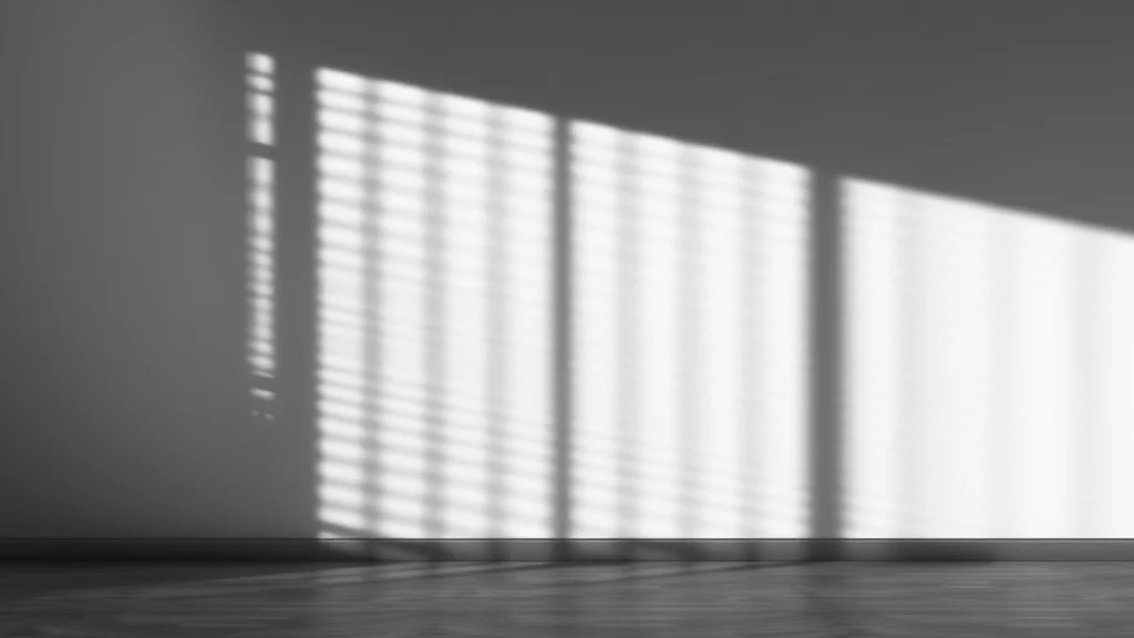
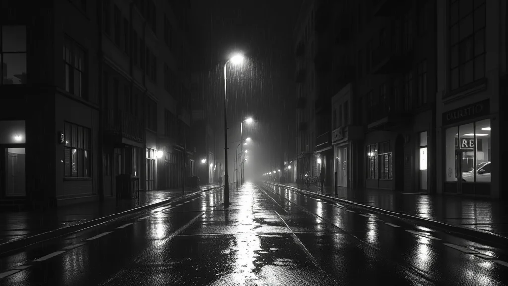
Film noir is a 1940s black and white detective-film aesthetic, and its entire identity is light, not color. A noir frame is built from one hard light source, usually raking in from the side or through a window, that carves the subject out of near-total darkness. The blacks are genuinely black, the highlights are blown bright, and the mid-grays are squeezed out so the image reads as stark contrast rather than a soft gradient. Then come the signatures: venetian-blind shadow stripes falling across a face or bare shoulder, cigarette smoke hazing the air, rain-slick streets throwing back specular glints, and a general mood of glamorous dread.
It is worth separating noir from two looks people confuse it with. It is not goth, which is a modern subculture built on fashion and pale skin, and it is not cyberpunk, which is defined by saturated neon in the dark. Noir is monochrome, period-specific, and its drama comes purely from the shape of shadow. If you see color, it is not noir.
Here is the mistake almost everyone makes on the first try. They tag grayscale or black and white and stop. The model dutifully desaturates a normally-lit photo and hands back a flat, evenly-gray image with no punch. That is a desaturated snapshot, not noir. Noir is a lighting design first and a color choice second, so the prompt has to describe the lights and the contrast curve, not just remove the color.
There is also a period grammar the era carries that you can borrow for free. Nineteen-forties films were shot on high-contrast film stock with hot tungsten lamps and hard reflectors, so faces have a sculpted, almost theatrical modelling. Wardrobe is silk, satin, fur, and tailored lines; sets are dim offices, hotel rooms, and rain-streaked streets. When you name the decade in the prompt, the model pulls in that whole world, which is why 1940s black and white film does more work than a generic black and white. Lean on the era, not just the palette.
Best checkpoints and LoRAs for film noir
You want a checkpoint that handles dramatic lighting and does not panic when half the frame is black. Photoreal SDXL models generally do this well once you push them with the right lighting tags, and a dedicated noir or black-and-white LoRA locks the tonality.
| Pick | Base | Why it works for noir |
|---|---|---|
| RealVisXL | SDXL | Photoreal skin that survives hard low-key lighting |
| Juggernaut XL | SDXL | Strong contrast handling, clean specular highlights |
| epiCRealism XL | SDXL | Renders smoke and haze convincingly |
| ZavyChroma XL | SDXL | Excellent single-source shadow shaping |
| Pony-based realism merge | Pony | Best NSFW pose control, add a film-noir LoRA on top |
Add a film-noir or “1940s black and white film” LoRA at 0.6 to 0.8 to lock the monochrome grade and period look. A separate “hard light” or “chiaroscuro” LoRA at 0.4 helps if your base keeps softening the shadows. For NSFW anatomy on a Pony base, keep a body LoRA low at 0.4 so it does not overpower the tonal LoRA. The best NSFW LoRAs roundup covers weighting, and best Stable Diffusion checkpoints has the current realism picks.
One checkpoint trait matters more than raw realism here: how the model handles atmosphere. Noir scenes are full of smoke, haze, and rain, and a lot of checkpoints render those as a flat gray fog that kills the depth. Test your candidate by prompting cigarette smoke haze alone and see whether you get volumetric wisps with structure or a lifeless smudge. EpiCRealism XL and Juggernaut XL tend to win this test. If your favorite realism model fails it, keep it for the figure and add the smoke and rain in a light img2img or an editor pass rather than fighting the base to produce atmosphere it cannot.
The prompt: copy-paste positive tags
Lead with the medium and era so the whole render commits to monochrome, then describe the lighting design explicitly.
film noir, 1940s black and white film, monochrome, high contrast,
chiaroscuro lighting, single hard key light, low-key lighting,
venetian blind shadow stripes across body, deep blacks, blown highlights,
cigarette smoke haze, rain on window, wet reflections, dramatic shadow,
(portrait of an adult woman:1.2), femme fatale, silk robe half open,
dim detective office, moody atmosphere, 35mm film grain, cinematic
The load-bearing tags: single hard key light and low-key lighting are what actually create the noir shape, because they tell the model most of the scene is dark with one bright source. venetian blind shadow stripes is the instantly-recognizable noir signature and worth weighting up to (venetian blind shadow stripes:1.2). deep blacks, blown highlights push the contrast curve toward the two ends and away from mid-gray. cigarette smoke haze and rain on window add the atmospheric depth. Keep the subject an adult and the wardrobe period-appropriate. For structuring these into a repeatable recipe, see the NSFW AI prompt formula, and lean hard on lighting prompts because noir lives and dies on lighting vocabulary.
A quick note on describing the light source position, because it is the highest-leverage phrase in the whole block. light from the side, backlit in a doorway, light through window blinds, and rim light each produce a completely different noir composition. Side light gives you the classic half-lit face with one eye in shadow. Backlighting turns the adult woman into a glowing silhouette, all mood and no detail. Window-blind light drapes the stripes across skin. Pick one deliberately rather than letting the model average them into a soft frontal wash. When a frame feels weak, it is usually because no single light direction won.
Negative prompt for film noir
Your negative has one primary job: keep color out and keep the image from flattening into even gray.
color, colored, saturated, vibrant, flat lighting, evenly lit,
soft light, low contrast, gray wash, washed out, hdr, overexposed,
neon, rainbow, pastel, cartoon, anime, cel shading, painting,
bright daylight, studio softbox, lowres, blurry, extra fingers,
deformed hands, bad anatomy, watermark, signature, text
color, colored, saturated, vibrant stop any stray hue from leaking into the monochrome. flat lighting, evenly lit, soft light, low contrast, gray wash are the direct antidotes to the desaturated-snapshot failure, forcing the model back toward hard directional light. bright daylight, studio softbox remove the modern well-lit look that kills noir mood. neon and pastel keep it from drifting into cyberpunk or vaporwave. The negative prompts master list explains which of these carry real weight.
Settings: sampler, CFG, steps, resolution
Noir tolerates and even benefits from slightly higher CFG than a painterly style, because you want crisp edges on those shadow stripes. But do not go so high it blows the highlights into pure white with no detail.
| Setting | Value | Note |
|---|---|---|
| Sampler | DPM++ 2M Karras | Clean tonal separation |
| Alt sampler | Euler a | Slightly softer grain if 2M is too crisp |
| CFG | 5.5 to 7 | High enough for hard edges, not so high it clips highlights |
| Steps | 30 to 40 | Resolves smoke and grain |
| Resolution | 832×1216 or 896×1152 | Portrait framing suits noir |
| Hires fix | 1.5x, denoise 0.35 | Preserves the contrast curve |
| Grain | add in post or via LoRA | 35mm grain sells the era |
If highlights keep clipping to featureless white, drop CFG by half a point and add blown highlights at normal weight rather than pushing exposure. The CFG and sampler settings guide covers the tradeoffs for high-contrast work.
Step-by-step workflow
- Commit to monochrome. Load a photoreal SDXL checkpoint plus a film-noir LoRA at 0.7. Confirm the LoRA trigger is in the prompt so the whole batch renders black and white, not just some frames.
- First txt2img pass. Paste both blocks, DPM++ 2M Karras, CFG 6.5, 35 steps, 832×1216. Batch 6 to 8 and hunt for a seed where the key light actually rakes across the subject and the blacks are truly dark.
- Shape the shadows. If the venetian-blind stripes are weak, weight the tag up and regenerate. This is the single most important noir signal, so do not settle for a frame without it.
- Hires pass. Enable hires fix at 1.5x, denoise 0.35, to firm up the grain and smoke without softening contrast.
- img2img contrast pass. Send to img2img at 0.3 denoise with the same prompt to deepen the blacks. Keep denoise low so it does not reintroduce color or soften the light.
- Fix face and hands. Run ADetailer on the face at 0.25 with the same monochrome prompt so the refined face stays black and white. Inpaint hands via the inpainting guide if needed.
- Lock the pose. For a specific femme-fatale pose or the classic backlit-in-a-doorway silhouette, use ControlNet OpenPose on the first pass. The img2img guide covers refinement denoise ranges.
Where film noir breaks, and the fix
| Failure | Cause | Fix |
|---|---|---|
| Flat even gray | Only tagged grayscale | Add chiaroscuro, single hard key light, low-key, deep blacks |
| Color leaking in | Weak monochrome lock | Add color, saturated, vibrant to negative, raise noir LoRA |
| Highlights blown to white | CFG too high | Drop CFG to 5.5 to 6, keep blown highlights at normal weight |
| No shadow stripes | Missing signature tag | Weight (venetian blind shadow stripes:1.3) |
| Looks like cyberpunk | Neon token leak | Add neon, rainbow, pastel to negative |
| Muddy mid-tones | Contrast curve too soft | img2img at 0.3, add high contrast, deep blacks |
| Modern well-lit look | Softbox lighting | Add bright daylight, studio softbox, evenly lit to negative |
The number one fix is simply describing the light instead of only removing the color. Everything else is secondary. For a broader diagnostic approach, how to get better NSFW AI results covers the order to test changes.
Film grain and the period texture
A clean, noise-free black and white image still looks modern, like a phone photo run through a filter. Real noir was shot on film, and that grain is part of what dates it correctly. Add 35mm film grain, analog film, slight noise to the positive, or apply a grain LoRA at low weight, and the image immediately reads as an era rather than an edit. Keep the grain subtle: heavy grain plus high contrast can crush fine detail in the darks. If you are upscaling, add the grain after the upscale, because most upscalers smooth it away and you end up with a suspiciously clean result. A touch of vignette also helps, since period lenses fell off toward the edges and that darkening pulls the eye to the lit subject.
Color grading without color
It sounds odd to color-grade a black and white image, but the grade is the whole game in noir. What you are actually adjusting is the tonal curve: how fast the image falls from highlight to shadow, and where the blacks clamp. In-prompt you steer this with deep blacks, crushed shadows, blown highlights, high contrast. In a final pass you can push it further in any editor by pulling the black point up and the contrast hard, which crushes the lingering mid-grays that make an image look like a flat photo instead of a lit set. The color grading prompts guide has the tonal-curve vocabulary, and the mood and atmosphere prompts piece covers the smoke, rain, and dread that complete the scene. A good rule: if you can clearly see detail in every part of the frame, it is not contrasty enough for noir yet. Noir hides things. Whole limbs and half a face can disappear into black, and that concealment is exactly what makes the lit parts feel dramatic and, for NSFW work, suggestive rather than clinical. Let the shadow do the covering.
There is a subtle warm-versus-cool choice hiding in the monochrome too. Even a black and white image can be toned slightly warm (a sepia lean) for a nostalgic, smoky-office feel, or slightly cool (a blue-gray lean) for a colder, rain-on-the-street feel. You steer this with warm tone or cool tone in the prompt or with a split-tone adjustment in post. It is a small move that changes the emotional read of the whole frame, so decide which mood the scene wants before you finalize.
When to level up
Once single noir frames land reliably, push toward series and control. If you want the same adult femme fatale across a set of shots, character consistency techniques keeps her face and figure locked while you vary the lighting and pose. To turn your exact contrast-and-grain recipe into a one-word trigger, train a style LoRA on a curated set of noir stills so you stop stacking tonal tags every session. And because noir depends so heavily on crisp shadow edges and grain, how to add detail to NSFW AI images walks the upscale and refinement stack that keeps those hard edges from going soft when you enlarge. Master the light and the rest of the aesthetic follows almost on its own. Get the single hard key right, crush the blacks, drop in the stripes, and even a simple portrait carries the full weight of the genre without any extra tricks.
Frequently asked questions
Why does my film noir art look like flat gray instead of dramatic black and white?
You probably only tagged grayscale or black and white, which just desaturates a normally-lit scene. Noir is a lighting design, so add chiaroscuro, single hard key light, low-key lighting, deep blacks, high contrast. Describe the light and the contrast curve, not only the absence of color.
How do I get the venetian blind shadow stripes?
Add venetian blind shadow stripes across body to the positive prompt and weight it up to around 1.2 or 1.3 if it is weak. Pair it with single hard key light and rain on window so the model understands a hard directional source is casting through blinds. Regenerate until the stripes clearly land.
What CFG works best for film noir?
Use 5.5 to 7. Noir wants crisp edges on the shadow stripes, so slightly higher CFG than a painterly style helps, but above 7 the highlights clip to featureless white. If bright areas lose all detail, drop half a point and keep blown highlights at normal weight rather than raising exposure.
How is film noir different from cyberpunk or goth?
Film noir is 1940s monochrome defined by hard chiaroscuro light and deep blacks, with no color at all. Cyberpunk is defined by saturated neon in darkness, and goth is a modern fashion subculture. If your frame has color, it is not noir. Keep neon, pastel, color in the negative to stay in the noir lane.
Which checkpoint is best for noir NSFW output?
Photoreal SDXL models like RealVisXL, Juggernaut XL, or epiCRealism XL handle hard low-key lighting and render smoke well. For NSFW pose control, use a Pony-based realism merge with a film-noir LoRA on top at 0.6 to 0.8 to lock the monochrome grade and period feel.
Why does color keep leaking into my black and white image?
Your monochrome lock is too weak. Raise the film-noir LoRA weight, put color, colored, saturated, vibrant in the negative, and lead the positive prompt with monochrome, black and white, 1940s black and white film. Front-loading the medium tags gives them more influence over the whole render.
Can I color grade a black and white noir image?
Yes, and you should. The grade in noir is the tonal curve, not hue. Push deep blacks, crushed shadows, blown highlights, high contrast in the prompt, then in any editor raise the black point and increase contrast to crush the flat mid-grays. That final curve is what separates a lit noir set from a desaturated snapshot.
How do I add cigarette smoke and rain atmosphere?
Add cigarette smoke haze, rain on window, wet reflections to the positive prompt, and make sure your checkpoint renders haze well (epiCRealism XL and Juggernaut XL do). Keep steps at 35 to 40 so the smoke resolves with texture instead of a gray smudge, and refine in a low-denoise img2img pass if needed.