To make retro anime NSFW AI art, run an Illustrious, Pony, or WAI base with 1980s anime, retro anime, cel shading, muted colors, film grain, screentone plus a retro-anime LoRA, and keep every subject an explicit adult woman, mature. The trick is dirtying up the too-clean modern render: add grain, mute the palette, flatten the cels.
What the retro anime look actually is
Retro anime means the eighties and nineties cel-animation aesthetic, the era of hand-painted OVAs and TV series before digital compositing took over. Think of the AIC and studio-OVA productions of that period. The visual fingerprints are specific: physical cel shading with a limited number of flat tone steps rather than smooth gradients, muted analog color that looks slightly aged and desaturated, visible film grain and gate weave from being shot on film, screentone dot patterns in some areas, and character designs with the proportions and rendering conventions of that decade, bigger hair, softer noses, painted highlights in the eyes.
Two hard distinctions. Retro anime is not modern anime, which is hyper-clean, high-resolution, smoothly gradient-shaded, and vividly saturated with perfect digital line-art. And it is not western cartoon, which uses different proportions and outline conventions entirely. Retro anime sits in its own pocket: unmistakably Japanese animation, but with the warmth, grain, and imperfection of the analog era baked in.
A few more period fingerprints are worth naming because they help the model commit. Old cel work used a limited paint palette, so shadows were a single darker flat tone with a hard boundary, not a soft airbrushed falloff. Lines were inked by hand and vary slightly in weight, giving them a warmer, less mechanical feel than vector-perfect modern lineart. Color often sat slightly warm and low-contrast because of the film transfer, so whites are rarely pure white and blacks are rarely pure black. And there is a compositional habit to the era, dramatic angles, painted background art that looks like actual gouache or watercolor rather than a photo-real digital plate. Ask for painted background, matte painting background and the whole frame reads more authentically vintage.
Before anything else, a firm rule for this style and this niche: every character you generate must be an explicit adult. The retro-anime look leans on a certain nostalgia, but the rendering style must never be used to imply youth. Always specify adult woman, mature, grown woman (or adult man) in the prompt, give the character adult proportions and adult context, and keep child, teen, young, loli in the negative on every single generation. This is non-negotiable. The aesthetic is about film grain and painted cels, not about age.
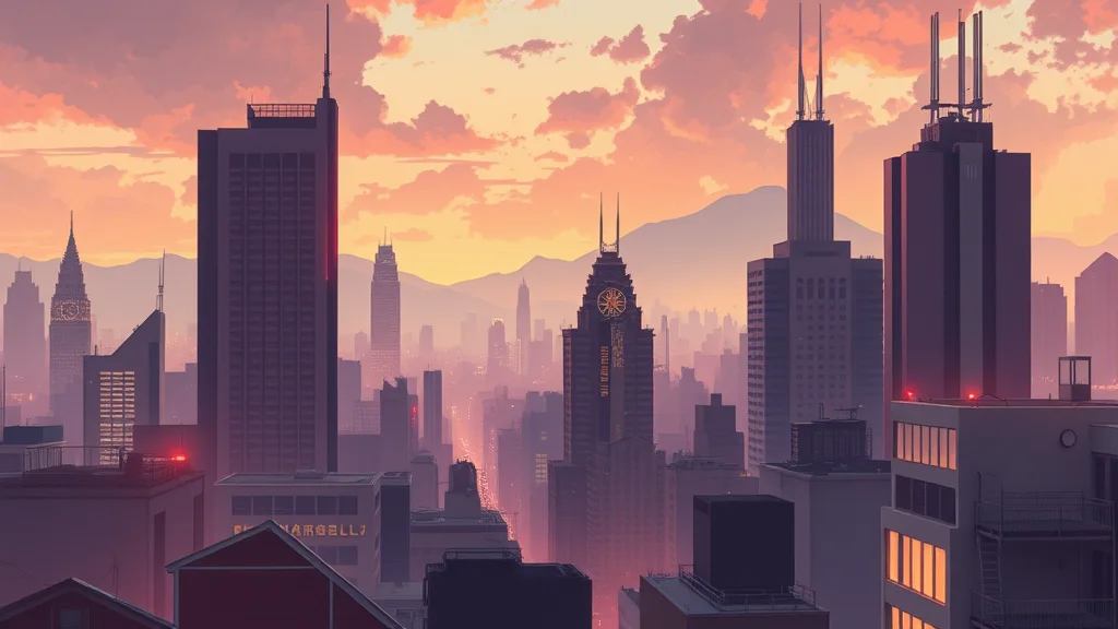
Best checkpoints and LoRAs for retro anime
Modern anime bases are extremely good, which is the problem: they are too clean. You can still hit the retro look with them, but you have to fight their default toward crisp digital perfection using tags and a LoRA. Illustrious, Pony, and WAI all get there with the right setup.
| Pick | Base | Why it works for retro anime |
|---|---|---|
| WAI NSFW Illustrious | Illustrious | Strong anime rendering, retro tags land well with a LoRA |
| Illustrious art merge | Illustrious | Flexible shading control, good screentone response |
| Pony Diffusion art merge | Pony | Best NSFW pose control, add a retro-anime LoRA |
| Anime-focused SDXL merge | SDXL | Softer default that reads slightly older |
| NoobAI / retro-tuned merge | Illustrious | Some merges lean vintage out of the box |
The single most important asset is a dedicated 1980s or retro-anime style LoRA at 0.6 to 0.9. This is what shifts the base from modern-clean to analog-aged: it brings the muted palette, the flatter cels, and often the grain. Stack a film-grain or VHS LoRA at 0.3 if the retro LoRA does not add enough texture. Keep any NSFW body LoRA at 0.4 so it does not overpower the style.
Not all retro LoRAs are equal, so test a couple before committing. Some are trained tightly on one studio or one show and will drag every character toward that exact face, which is great if you want that look and frustrating if you want your own design. Others are broad style LoRAs that shift shading and palette without hijacking the character. For flexible work, prefer the broad ones and let your prompt define the adult character. If a LoRA keeps forcing a specific recognizable face, lower its weight to 0.5 and lean harder on the tag list to carry the era, since the tags age the render without locking the identity. For how to drive these bases, see how to use Illustrious models and the WAI NSFW Illustrious guide, and Pony Diffusion guide if you prefer that base. The best Illustrious checkpoints list covers current merges.
The prompt: copy-paste positive tags
Lead with the era and the medium, then the shading and texture, then the explicitly-adult subject.
1980s anime style, retro anime, vintage anime aesthetic, OVA style,
cel shading, hand painted cels, flat color, limited palette,
muted colors, desaturated retro palette, faded film look,
film grain, analog film, gate weave, screentone shading,
(adult woman:1.3), mature, grown woman, curvy adult figure,
retro character design, painted eye highlights, 80s anime hair,
soft analog lighting, nostalgic, aged film
The load-bearing tags: 1980s anime style, retro anime, OVA style set the era. cel shading, hand painted cels, flat color, limited palette force the flat stepped shading of the period instead of modern smooth gradients. muted colors, desaturated retro palette, faded film look age the color. film grain, analog film, gate weave add the physical-film texture that is the biggest single tell of the era. screentone shading brings the dot patterns. Weight (adult woman:1.3) up and reinforce with mature, grown woman, curvy adult figure so the subject is unambiguously adult. Adding grown-adult context such as office worker, wine glass, sophisticated further anchors the age read and is a good habit for this style. For building the prompt structure, the NSFW AI prompt formula helps, and best anime NSFW generators covers the tools if you are not running locally.
Negative prompt for retro anime
The negative fights the modern-clean default and enforces the adult subject.
child, teen, young, loli, shota, underage, teenager,
modern anime, clean lineart, smooth shading, gradient shading,
high saturation, vibrant, glossy, 3d, cgi, digital painting,
hyperdetailed, ultra sharp, photorealistic, blurry, lowres,
extra fingers, deformed hands, bad anatomy, watermark, signature, text
child, teen, young, loli, shota, underage, teenager come first and stay on every generation without exception; they are the safety floor for this style. modern anime, clean lineart, smooth shading, gradient shading are the direct antidotes to the too-clean result, pushing the render back toward flat retro cels. high saturation, vibrant, glossy keep the palette muted and aged. 3d, cgi, digital painting, photorealistic stop it drifting out of hand-drawn anime. The negative prompts master list explains token strength.
Settings: sampler, CFG, steps, resolution
Retro anime wants flat, slightly soft rendering, so a moderate CFG and a smooth sampler suit it. Very high CFG produces the ultra-sharp modern look you are trying to avoid.
| Setting | Value | Note |
|---|---|---|
| Sampler | Euler a | Slightly softer, more analog feel |
| Alt sampler | DPM++ 2M Karras | Cleaner if Euler a is too soft |
| CFG | 4.5 to 6 | Above 6.5 it sharpens toward modern anime |
| Steps | 26 to 32 | Enough for cels, not so many it over-refines |
| Resolution | 832×1216 or 896×1152 | Portrait suits character art |
| Clip skip | 2 | Standard for Illustrious and Pony |
| Hires fix | 1.5x, denoise 0.3 | Add grain after, not before, upscaling |
If the result stays too clean, drop CFG to 4.5, raise the retro LoRA, and add grain in post. The CFG and sampler settings guide has the details, and since these are anime bases, how to use Illustrious models covers the base-specific settings.
The sampler choice matters more here than in most styles. Ancestral samplers like Euler a inject a little noise at each step, and that faint texture actually helps the analog feel rather than hurting it, which is the opposite of what you want for a clean modern render. If you use a crisp deterministic sampler you may find the image resolves too perfectly and you have to add more grain in post to compensate. Neither is wrong, but knowing that the sampler is nudging the texture lets you plan your post-processing instead of being surprised by how clean or noisy the raw output looks.
Step-by-step workflow
- Confirm the adult subject. Before generating, verify
(adult woman:1.3), matureis in the positive and the full minor-blocking list is in the negative. Do this every session. - Set the retro base. Load WAI or an Illustrious merge plus a 1980s retro-anime LoRA at 0.8, clip skip 2.
- First txt2img pass. Paste both blocks, Euler a, CFG 5, 30 steps, 832×1216. Batch 6 to 8 and select a seed where the shading is flat and stepped, the palette is muted, and the character clearly reads as an adult.
- Check the tell. The fastest way to judge retro versus modern is the grain and the palette. If it looks crisp and vivid, it is still modern; raise the retro LoRA and drop CFG.
- Hires pass. Enable hires fix at 1.5x, denoise 0.3, keeping the flat shading intact.
- Add grain and screentone. If the film grain is weak, apply it after the upscale via a grain LoRA in a low-denoise img2img or in an editor, since upscalers smooth grain away. The img2img guide covers low-denoise refinement.
- Fix face and hands. Run ADetailer on the face at 0.25 with the same retro prompt so the eyes keep the painted-highlight look. Inpaint hands via the inpainting guide if needed. Keep the adult descriptors in the ADetailer prompt.
Where retro anime breaks, and the fix
| Failure | Cause | Fix |
|---|---|---|
| Looks like modern anime | Base default too clean | Raise retro LoRA, add modern anime, smooth shading to negative |
| Colors too vivid | Missing mute tokens | Add muted colors, desaturated retro palette, faded film look |
| No film grain | Grain smoothed away | Add grain after upscale via LoRA or editor |
| Shading too smooth | Gradient shading leaking | Add gradient shading, smooth shading to negative, push cel shading, flat color |
| Subject reads too young | Weak adult tags | Weight (adult woman:1.3), mature, keep full minor-block negative, add adult context |
| Over-sharp lineart | CFG too high | Drop CFG to 4.5, switch to Euler a |
| Screentone missing | Weak texture tag | Add screentone shading and a screentone LoRA if available |
The two things to watch are the modern-clean drift and, above all, the adult-subject enforcement. Never ship a frame where the character could read as anything other than an adult. For the general diagnostic order, how to get better NSFW AI results is the reference, and best anime NSFW generators lists tools with the right base models.
Why modern bases fight you, and how to win
It is worth understanding why this style takes extra effort. The anime checkpoints everyone uses in 2026 were trained heavily on recent, high-resolution digital art, so their strong prior is clean lines, smooth gradient shading, and vivid color. That is the opposite of the analog era. You are not adding retro so much as subtracting modern: muting the saturation, flattening the shading into steps, and reintroducing the grain and slight imperfection that film gave for free. Three levers do most of the work. First, the retro LoRA, which biases the whole render toward the aged look. Second, the negative, where modern anime, smooth shading, high saturation actively push the prior away. Third, post-processing grain and a desaturating color grade, which are quick and reliable because they do not depend on the model cooperating. If you get a result that is close but still too clean, do not keep re-rolling; instead run it back through a low-denoise img2img with the retro LoRA weighted higher, which nudges an almost-there image the last step without regenerating the composition. The color grading prompts guide has the palette-muting vocabulary that pairs with this. A practical test to know you have arrived: put your result next to an actual eighties OVA still. If yours is noticeably sharper, brighter, and cleaner, you are not there yet, and the fix is almost always more grain and less saturation rather than a different prompt. Keep a small folder of reference frames from the era on hand and glance at them before you finalize, because the eye recalibrates quickly and an image that looked convincingly retro an hour ago can suddenly read as modern once you compare it to the real thing.
When to level up
Once retro frames land reliably with correct adult subjects, push toward consistency and control. If you want the same adult woman across a retro-anime series, character consistency techniques keeps her design locked while you change scenes. To capture your exact grain-and-mute recipe in one trigger word so every generation starts retro, train a style LoRA on a curated set of eighties and nineties references. And because grain and flat cels reward careful enlarging, how to add detail to NSFW AI images walks the upscale approach that keeps the analog texture from being smoothed into a modern render. Subtract the modern, add the grain, and keep every character an adult, and the OVA-era look comes through cleanly. Treat the muted palette and the film grain as the two things you never skip, hold the adult descriptors as an absolute constant, and the rest of the aesthetic is just tuning the flatness of the cels until it feels like a frame paused from a decades-old tape.
Frequently asked questions
How do I keep retro anime characters clearly adult?
Weight (adult woman:1.3) up front, reinforce with mature, grown woman, curvy adult figure, give the character adult proportions and context, and keep child, teen, young, loli, shota, underage in the negative on every single generation. Do this every session without exception. The retro style is about film grain and painted cels, never about implying youth.
Why does my retro anime look like modern anime instead?
Modern anime checkpoints default to clean lines, smooth gradient shading, and vivid color. Raise your 1980s retro-anime LoRA to 0.8 or higher, add modern anime, smooth shading, high saturation to the negative, drop CFG to around 4.5, and add film grain in post. You are subtracting modern more than adding retro.
Can Pony, Illustrious, and WAI do the retro anime look?
Yes, all three can with the right tags and a retro-anime LoRA. They are modern and clean by default, so you steer them with 1980s anime, cel shading, muted colors, film grain plus the LoRA at 0.6 to 0.9. WAI NSFW Illustrious and Illustrious art merges respond especially well to the retro tags and screentone.
How do I get the muted analog color of old anime?
Add muted colors, desaturated retro palette, faded film look, aged film to the positive and high saturation, vibrant, glossy to the negative. Finish with a desaturating color grade in post that pulls the palette slightly toward warm and lowers saturation. Old cel anime looks aged because the film stock and paint were never as vivid as modern digital color.
What creates the film grain and screentone texture?
Film grain comes from film grain, analog film, gate weave in the prompt plus a grain LoRA, applied after upscaling since upscalers smooth grain away. Screentone comes from screentone shading and a screentone LoRA if you have one. Both are the biggest tells of the era, so do not skip them; a grain-free image reads as modern no matter what else you do.
What CFG and sampler suit retro anime?
Use CFG 4.5 to 6 with Euler a for a slightly softer, more analog feel. CFG above 6.5 sharpens the render toward the crisp modern-anime look you are avoiding. If Euler a is too soft, DPM++ 2M Karras is a cleaner alternative. Clip skip 2 is standard for Illustrious and Pony bases.
How is retro anime different from modern anime and western cartoon?
Retro anime is the eighties and nineties cel era: flat stepped shading, muted aged color, film grain, screentone, and period character design. Modern anime is hyper-clean, high-resolution, smoothly gradient-shaded, and vividly saturated. Western cartoon uses entirely different proportions and outline conventions. Retro anime is unmistakably Japanese animation with analog-era warmth and imperfection.
My retro anime came out close but still too clean, what now?
Do not keep re-rolling the seed. Run the almost-there image back through a low-denoise img2img at about 0.3 with the retro-anime LoRA weighted higher. That nudges an already-good composition toward the aged look without regenerating it, then add grain and a desaturating grade in post. This salvages a near-miss far faster than hunting a new seed.