To make concept art NSFW AI, prompt concept art, character design, key visual, painterly, loose confident brushwork, cinematic value composition, dramatic lighting, trending on artstation, matte painting on an SDXL semi-real base, then run a rough-to-polished img2img pipeline: block in values, then refine at descending denoise, so it reads as painted key art, not a flat over-rendered photo.
What the concept art look actually is
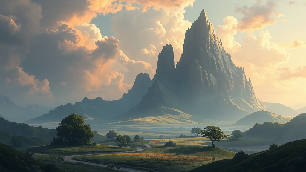
Concept art is the painterly game and film illustration style you see on ArtStation: character design sheets, key visuals, and cinematic environment paintings with loose confident brushwork, strong value composition, and dramatic lighting. It reads as a painting made by a professional working fast and decisively, not as a hyper-detailed photo and not as a clean anime cel.
This differs from the 3D and fantasy posts in one important way. Those focus on subject and render medium. This post is about the concept-art render pipeline: the rough block-in to polished key-art workflow that produces the ArtStation look. You can point that pipeline at a fantasy subject or a modern one, the style is in the process and the finish, not the theme.
The two things that define good concept art are value and brushwork. Value means a strong, readable light-to-dark composition that works even in greyscale. Brushwork means visible, confident, painterly strokes that suggest detail rather than rendering every pore. The failure mode is either a flat over-rendered plastic image with no value structure, or a muddy grey mess with no focal point.
The reason the pipeline matters so much here, more than in most styles, is that concept art is defined by a sense of decisions being made. A photograph captures everything at once, but a concept painting shows a human choosing what to emphasize and what to leave loose. The rough-to-polished img2img ladder mimics exactly that process: you commit to a composition and a value structure first, then spend detail deliberately where it counts. Skip that staging and you get an image that has detail everywhere and emphasis nowhere, which is the tell of AI concept art that has not been directed.
The visual fingerprints to aim for
- Loose, confident, visible painterly brushwork
- Strong cinematic value composition, clear focal point
- Dramatic directional lighting with deliberate shadow shapes
- A semi-realist painted finish, not photoreal, not flat cel
- Character-sheet or key-visual framing and drama
Best checkpoints and LoRAs for concept art
You want a semi-real painterly base that takes lighting direction and does not lock to either photo or anime.
| Pick | Base model | Why it works for concept art |
|---|---|---|
| SDXL semi-real painterly finetune | SDXL | Best balance of realism and visible brushwork |
| SDXL base 1.0 + concept-art LoRA | SDXL | Neutral canvas, LoRA injects ArtStation painterly finish |
| Illustrious semi-real finetune | Illustrious | Handles painterly key art with clean anatomy |
| Realistic SDXL finetune (for img2img polish) | SDXL | Adds believable material detail in the final refine pass |
| Concept-art / matte-painting LoRA | SDXL | Pushes loose brushwork, cinematic value, key-art framing |
Run a concept-art or matte-painting LoRA at 0.5 to 0.7. See our best stable diffusion checkpoints roundup, the best NSFW LoRAs list, and how to make realistic AI porn for the realism side of the pipeline.
The prompt: copy-paste positive tags
Front-load the medium and the ArtStation cues, then lighting, then the subject.
concept art, character design, key visual, character sheet,
painterly, loose confident brushwork, visible brush strokes,
cinematic value composition, dramatic directional lighting, strong shadows,
trending on artstation, matte painting, semi realistic painting,
detailed but painterly, rich color grading, atmospheric,
(adult woman:1.2), original character, dynamic pose, striking silhouette,
professional concept art, key art illustration
Load-bearing tokens:
concept art, character design, key visualset the framing and intent.painterly, loose confident brushwork, visible brush strokesenforce the painted finish.cinematic value compositionanddramatic directional lightingbuild the value structure.trending on artstation, matte paintingpull the specific ArtStation register.semi realistic paintingkeeps it between photo and cel.
Use our lighting prompts guide to sharpen the drama and the color grading prompts for the cinematic palette. The prompt formula guide covers ordering.
Negative prompt for concept art
You are banning the two failure poles: flat over-rendered plastic, and muddy formlessness.
flat lighting, flat color, plastic, 3d render, cgi, photorealistic photo,
overrendered, waxy skin, smooth airbrush, cel shading, anime flat,
lineart, muddy, low contrast, washed out, dull colors, no focal point,
blurry, lowres, bad anatomy, extra fingers, deformed hands,
watermark, signature, text, jpeg artifacts
Key entries: flat lighting, flat color, no focal point fight the muddy no-value failure. overrendered, waxy skin, plastic, smooth airbrush fight the over-rendered photo failure. cel shading, anime flat, lineart keep it painterly rather than flat illustration. Pull more from our negative prompts master list.
Settings: sampler, CFG, steps, resolution
The concept-art pipeline is defined by the img2img denoise ladder, not a single render. Here are the pass settings.
| Pass | Denoise | CFG | Purpose |
|---|---|---|---|
| Block-in (txt2img) | n/a | 6 to 7 | Establish value composition and silhouette |
| Rough refine (img2img) | 0.55 to 0.65 | 6 | Add structure, keep it loose and painterly |
| Detail refine (img2img) | 0.35 to 0.45 | 6 to 7 | Tighten focal areas, add material suggestion |
| Polish (img2img) | 0.2 to 0.3 | 7 | Final crisp on face and key edges only |
| Sampler | DPM++ 2M Karras | throughout | Smooth painterly falloff |
| Resolution | 1216×832 or 832×1216 | throughout | Cinematic key-art aspect |
Descending denoise is the whole method. Each pass keeps the previous composition and adds a level of finish, so you build from rough to polished without losing the value structure. Our img2img guide explains the denoise ladder, and the CFG and sampler settings guide covers CFG behavior.
Step-by-step workflow
- Load an SDXL semi-real painterly checkpoint, add a concept-art LoRA at 0.6.
- Paste the positive block with your original adult character tags and the full negative block.
- Block in: txt2img at CFG 6.5, 30 steps, 1216×832. Batch 6. You are hunting for a strong silhouette and value composition, not detail. Pick on composition, ignore rough detail.
- Rough refine: send the winner to img2img at 0.6 denoise, same prompt. This adds structure while keeping the painterly looseness. Batch 3, pick the best value read.
- Detail refine: img2img at 0.4 denoise. Now the focal areas tighten and materials start to suggest themselves. Keep brushwork visible, do not over-refine.
- Polish: img2img at 0.25 denoise on the final composition to crisp the face and key edges only.
- Run ADetailer on the face at 0.3 denoise with the concept-art tags so the face stays painterly, not photoreal.
- Optional: inpaint a stronger rim light or a darker shadow shape to sharpen the value composition. See the inpainting guide.
- Optional final color grade for the cinematic palette.
The descending-denoise ladder in steps 3 to 6 is the entire concept-art technique. A single txt2img render gives you either a rough sketch or an over-rendered photo. Building through passes at 0.6, then 0.4, then 0.25 lets you lock a strong value composition early and add finish gradually, which is exactly how a working concept artist paints from block-in to key art. For the more advanced version of this, you can hand-paint or ControlNet a value block-in and feed that as the pass-one input for total control.
Where concept art breaks, and the fix
The two poles again: over-rendered and muddy. Plus the usual anatomy issues.
| Symptom | Cause | Fix |
|---|---|---|
| Flat over-rendered plastic photo | Denoise ladder skipped, single high-detail pass | Rebuild with the descending-denoise passes, add painterly, visible brush strokes |
| Muddy grey mess, no focal point | Weak value composition | Add cinematic value composition, strong shadows, clear focal point, boost contrast |
| Waxy plastic skin | Over-refined, denoise too low too early | Keep the 0.6 rough pass loose, do not jump straight to 0.25 |
| Looks like flat anime cel | Painterly tokens too weak | Add semi realistic painting, loose brushwork, ban cel shading, anime flat |
| Colors dull and washed out | No color grade | Add rich color grading, cinematic palette, atmospheric |
| Composition boring, no drama | Flat lighting and static pose | Add dramatic directional lighting, striking silhouette, dynamic pose |
| Detail everywhere, no hierarchy | Uniform refinement | Only polish the focal area at low denoise, leave edges loose |
The master rule: protect the value composition and keep some brushwork loose. The most common mistake is refining the whole image evenly until it becomes a flat over-rendered photo with no focal hierarchy. Real concept art keeps the edges and background loose and reserves the crisp detail for the focal point.
A second common mistake is over-climbing the denoise ladder. If you jump from the rough pass straight to a very low denoise, the image locks in before it has real structure and comes out stiff and waxy. If you linger too long at high denoise, the composition drifts and you lose the silhouette you liked. The ladder works precisely because each step is a modest drop, roughly 0.6 then 0.4 then 0.25, so the image keeps what it had and gains one level of finish. When a result looks wrong, check whether you skipped a rung: add the missing mid pass and the finish usually falls into place. Treat the numbers as a starting recipe and adjust by feel once you can see how each pass changes the render.
Which interface to run the concept-art pipeline in
The concept-art method is a multi-pass img2img ladder, so it rewards an interface that makes chained passes painless. Forge works well for a hands-on approach: you generate, send to img2img, drop the denoise, repeat, and run ADetailer at the end, all in one window. Our Stable Diffusion Forge setup guide covers the setup.
ComfyUI is the better home for the pipeline long term, because you can build the entire descending-denoise ladder, block-in, rough refine, detail refine, and polish, as a single graph and run it in one click. That is a huge time saver when you are iterating on a character sheet and want every pass at the same settings each time. The ComfyUI guide covers chaining sampler stages, and a depth or scribble ControlNet node slots straight into pass one so your painted value block-in drives the whole render. For choosing the semi-real base that anchors the look, see the best stable diffusion checkpoints roundup.
Value composition: the thing that separates good from amateur
If you learn one concept-art idea, make it value. Value is the light-to-dark structure of the image independent of color, and professional concept art is built on a strong value read: a clear focal point that is the point of highest contrast, a mid-value mass that supports it, and dark shapes that frame it. Amateur AI concept art usually fails here, everything sits at the same middle value, so the eye has nowhere to land and the image reads muddy.
Test your work by imagining it in greyscale. If the focal point does not pop when color is removed, the values are wrong. You can steer values in the prompt with strong value contrast, bright focal point against dark background, clear light and shadow masses, and you can enforce them by painting a rough three-value greyscale study and feeding it as the img2img base for pass one. That greyscale block-in approach, where you establish lights, mids, and darks before any color or detail exists, is exactly how studio concept artists start, and it gives you total control over where the eye goes.
Lighting drives value, so pick a clear lighting scenario before you generate: rim-lit against darkness, single dramatic key from the side, or backlit silhouette. Each creates a strong value structure automatically. Our lighting prompts guide has cinematic lighting phrasings, and the color grading prompts guide covers pushing a cohesive cinematic palette once the values are locked.
Keeping brushwork loose and painterly
The other half of the concept-art look is brushwork economy. A working concept artist suggests detail with a few confident strokes rather than rendering everything, which is why real key art has crisp detail at the focal point and loose, almost abstract handling at the edges. AI wants to render everything evenly, which flattens the image into an over-detailed photo, so you have to fight for looseness.
The denoise ladder already helps because you only polish the focal area at low denoise and leave the rest at higher, looser denoise. Reinforce it in the prompt with loose painterly edges, confident brushwork, suggested detail, unfinished edges, tight focal detail. Deliberately leaving the background and outer figure loose is not laziness, it is what creates the focal hierarchy that makes concept art feel professional. If every square inch is equally sharp, the image loses its key-art quality and becomes a flat render. Our how to add detail guide covers concentrating detail where it counts, and how to get better results has more on focal hierarchy.
When to level up
Once the ladder works, take control of the block-in. Instead of trusting txt2img for pass one, paint a rough greyscale value study yourself (or pull a value composition via ControlNet depth or a scribble), then run the img2img ladder on top. That gives you full authorship of the composition and lighting, which is how professional concept artists actually work, generation just accelerates the rendering.
Build character-design sheets by generating multiple angles of the same original adult character and arranging them, and develop key visuals with an environment behind the figure. For consistency across a design series, lock the person with a character LoRA and keep the concept-art tokens in the prompt. Our character consistency techniques guide covers the methods, ControlNet covers depth and scribble control, and the best NSFW AI art styles overview shows how concept art sits next to the other painterly styles.
Frequently asked questions
What is the concept-art style in AI generation?
It is the painterly game and film illustration look you see on ArtStation: character design sheets and key visuals with loose confident brushwork, strong value composition, and dramatic lighting. It reads as a fast, decisive professional painting, not a photo and not a flat anime cel. The style lives in the render pipeline and finish, so you can point it at any subject, fantasy or modern.
How is concept art different from 3D or fantasy styles?
The 3D and fantasy approaches focus on subject and render medium. Concept art is about the render pipeline itself: the rough block-in to polished key-art workflow that produces the ArtStation painterly finish. You can apply that pipeline to a fantasy or a modern subject. The defining traits are value composition and visible brushwork, not the theme of the image.
What is the rough-to-polished img2img pipeline?
It is a descending-denoise ladder. Block in the value composition with txt2img, then run img2img at 0.6 denoise to add loose structure, then 0.4 to tighten focal areas, then 0.25 to polish the face and key edges only. Each pass keeps the previous composition and adds finish, so you build from rough to polished without losing the value structure, exactly how a concept artist paints.
Why does my concept art look flat and over-rendered?
You likely refined the whole image evenly in one high-detail pass, which flattens it into a plastic photo with no focal hierarchy. Rebuild using the descending-denoise ladder, add painterly, visible brush strokes to the prompt, and only polish the focal area at low denoise while leaving edges and background loose. Concept art reserves crisp detail for the focal point.
How do I fix a muddy concept-art result?
Muddiness is a weak value composition. Add cinematic value composition, strong shadows, clear focal point to the prompt and boost contrast. Check that your image reads clearly in greyscale, if it does not, the values are too close. Inpaint a stronger rim light or a darker shadow shape to create separation and a clear focal point, and add a color grade if the palette is washed out.
Which checkpoint is best for painterly concept art?
An SDXL semi-real painterly finetune gives the best balance of realism and visible brushwork. SDXL base with a concept-art or matte-painting LoRA at 0.5 to 0.7 injects the ArtStation finish on a neutral canvas. Illustrious semi-real finetunes also work with clean anatomy. Use a realistic SDXL finetune for the final low-denoise polish pass to add believable material detail.
How do I get more authorship over the composition?
Take control of the block-in instead of trusting txt2img for pass one. Paint a rough greyscale value study yourself, or pull a composition via ControlNet depth or scribble, then run the img2img denoise ladder on top. That gives you full authorship of the composition and lighting while generation handles the rendering, which is how professional concept artists actually use these tools.
What CFG and sampler should I use for concept art?
Use DPM++ 2M Karras throughout at CFG 6 to 7. Render the block-in and later passes at a cinematic aspect like 1216×832 or 832×1216. The key is the denoise ladder rather than a single setting: 0.6 for rough refine, 0.4 for detail, 0.25 for polish. Keep brushwork visible by not over-refining, and reserve the lowest denoise for the focal point only.