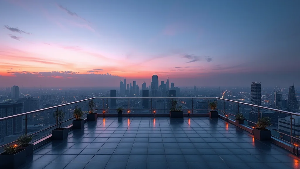
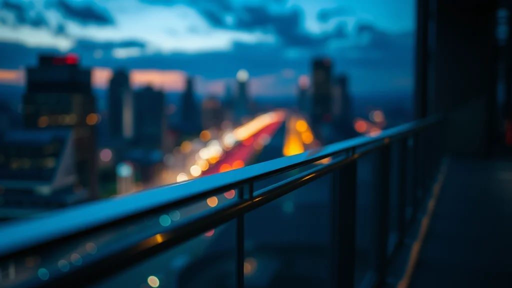
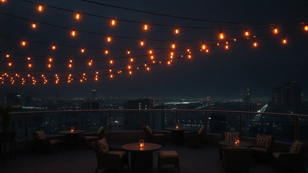
To make a believable rooftop NSFW AI scene, set an urban terrace at dusk: a glass railing, a city skyline behind, string lights, and lounge seating. Light it with a dusk sky gradient plus bokeh city lights below. Keep the horizon line consistent with the railing, place the subject at the terrace edge, then fix warped skylines, wrong perspective, and floating railings in post.
Why a rooftop scene fools you until it does not
A rooftop terrace at dusk is one of the most flattering environments you can build. The dusk gradient gives soft, warm light, the city behind adds instant production value, and the string lights and glass railing feel expensive. It reads as aspirational and intimate at the same time. The problem is that the background is a city, and cities are the single hardest thing for an image model to render coherently. Skylines come out warped, buildings melt into each other, windows form impossible grids, and the horizon tilts or bends. On top of that, a rooftop has strong perspective lines (the railing, the deck edge, the building tops) that all have to agree, and the model frequently breaks that agreement.
The difference between a rooftop scene and an open nature scene is precisely this urban geometry. Nature forgives soft, organic backgrounds. A rooftop demands that the skyline behave: straight verticals on the buildings, a level horizon, and a railing that sits in correct perspective with the deck. When those line up, the scene is gorgeous. When they do not, it screams AI. This guide covers the props, the dusk lighting, the staging, a copy paste prompt, and the specific fixes for warped skylines, bad perspective, and floating railings.
For a general grounding in environment prompting before the rooftop specifics, the setting prompt tags guide is a good starting point.
The setting and prop prompt tags
A rooftop reads as a rooftop through a few signature props: a glass or metal railing, a city skyline, lounge or lounge seating, string lights, and the dusk sky. Lead with the terrace and the skyline, then the props, then the light, then the atmosphere.
Here is a tag table to pull from. Pick a few per row rather than stacking everything.
| Element | Strong prompt tags |
|---|---|
| The terrace | urban rooftop terrace, rooftop lounge, high rise balcony, penthouse deck, city rooftop at dusk |
| Railing and deck | glass railing, glass balustrade, metal guard rail, wooden deck tiles, concrete parapet |
| Skyline | city skyline behind, distant skyscrapers, downtown skyline, glowing city buildings, urban horizon |
| Furniture and lights | lounge seating, outdoor sofa, string lights overhead, fairy lights, lanterns, low table |
| Sky | dusk sky, purple orange gradient sky, twilight, sunset glow, deep blue evening sky |
| Atmosphere and depth | bokeh city lights, glowing windows in the distance, soft evening haze, warm ambient glow |
The token that anchors the whole scene is “city skyline behind” combined with “dusk sky.” Those two set the urban, twilight identity that separates a rooftop from any other outdoor terrace. The second most valuable token is “bokeh city lights,” which lets the distant buildings fall into soft glowing points instead of forcing the model to render every window sharply (which it cannot do well).
For the emotional register, the mood and atmosphere prompt tags add words like “intimate,” “luxurious,” and “romantic” that suit a dusk rooftop.
Be intentional about the height the scene implies. A rooftop reads as a rooftop partly because the city sits below the subject, not level with her. If the skyline appears at the same height as her head, the scene looks like she is standing in a street, not on a terrace high above it. Prompt “high above the city,” “skyline below,” and “elevated terrace” so the model places the buildings lower in the frame and slightly beneath the railing line. That downward relationship between the subject and the city is one of the strongest cues that sells the height, and it also gives you a natural place to put the glass railing as the barrier between the terrace and the drop.
How to light a dusk rooftop
Dusk is the whole point, so lean into it. The primary light is the sky itself, a soft gradient running from warm orange near the horizon up to deep blue overhead. This wraps the subject in gentle, directionless fill with a warm side and a cool side. Prompt “dusk sky gradient,” “warm sunset glow from the horizon,” and “cool blue sky overhead.”
The secondary lights are the string lights and the city. String lights above give a warm local sparkle and a flattering edge on the subject. The city behind provides a field of bokeh points that reads as depth and glamour. Prompt “warm string lights,” “bokeh city lights behind,” and “glowing windows in the distance.”
Because dusk light is soft, the scene is naturally low contrast and forgiving on skin, which is why it flatters. Keep it that way: avoid hard flash or harsh shadows. This is essentially a golden hour setup pushed a little later into twilight, so the phrasing there transfers well. The general lighting prompt reference has ready made dusk phrases too.
For grading, a dusk rooftop wants warm highlights and cool shadows, the classic teal and orange split. The color grading prompt tags list tokens that push the image toward that cinematic twilight look without oversaturating.
Timing the dusk is worth thinking about. Early dusk still has a bright warm horizon and a light blue sky, which gives you more fill on the subject and a softer overall look. Late dusk (sometimes called blue hour) has a deep indigo sky and the city lights taking over as the main illumination, which is moodier and more dramatic but darker on the subject. Decide which you want before you prompt, because the two need different balances: early dusk leans on the sky as key light, while late dusk leans on the string lights and the city glow. Naming it explicitly (“early dusk warm horizon” versus “deep blue hour, city lights dominant”) gives the model a clearer target than a generic “dusk” token.
Staging, subject placement, and depth
Place the subject at the terrace edge, leaning on or standing near the glass railing, with the skyline behind and below. This placement is important because it puts the subject in the midground, the railing in the near midground, and the city in the far background, giving you three clean depth layers. It also grounds the subject against the railing so she does not appear to float in front of a pasted skyline.
The railing is a critical grounding element. It must sit in correct perspective with the deck and read as a real barrier the subject can touch or lean on. If the railing floats or bends, the whole rooftop collapses. Keep the subject in contact with it (a hand on the glass, hips against the rail) so the model commits to its position.
Depth comes from the skyline receding into bokeh. Use a shallow depth of field so the distant buildings soften into glowing points, similar to a bokeh photo build. This does double duty: it looks cinematic and it hides the model’s inability to render sharp distant architecture. For angle, eye level or a slightly low angle looking up at the subject with the sky behind works beautifully and keeps the horizon simple. The camera angle prompt tags list the tokens. Keep the subject an original adult character and avoid any recognizable real skyline that identifies a specific location tied to a real person.
A full copy paste example prompt
Here is a complete positive and negative block for an urban rooftop at dusk.
Positive:
photorealistic, an adult woman leaning on a glass railing on an urban rooftop terrace at dusk, city skyline behind and below, distant glowing skyscrapers, warm string lights overhead, lounge seating, dusk sky gradient from warm orange horizon to deep blue overhead, bokeh city lights, soft twilight glow on skin, intimate luxurious mood, shallow depth of field, 85mm lens look, level horizon, correct perspective, detailed skin texture, cinematic teal and orange grade

Negative:
warped skyline, melted buildings, bent skyscrapers, tilted horizon, floating railing, broken perspective, pasted on background, impossible window grid, harsh flash, flat lighting, extra limbs, deformed hands, watermark, text, lowres, cartoon, plastic skin, oversaturated
Swap the subject for an adult man or a couple, and adjust the skyline density and sky colors to taste. If the character must stay identical across several rooftop shots, run the set through a consistent photo set workflow or one of the character consistency techniques.
Sampler, CFG, and checkpoint notes
A dusk scene with a soft gradient sky rewards a sampler that resolves smooth tonal transitions cleanly. DPM++ 2M Karras at 30 to 35 steps is a reliable baseline. If the sky gradient bands into visible steps, switch to DPM++ SDE Karras, which smooths gradients well.
Keep CFG moderate, around 5 to 7. Dusk is a low contrast, soft look, and high CFG will oversaturate the sky and harden the light, killing the gentle twilight feel. Lower CFG preserves the smooth gradient and the flattering soft light. The CFG and sampler settings guide has the full breakdown.
For the checkpoint, a realism model gives the best skin under soft light and the most coherent architecture. RealVisXL and epiCRealism both do dusk light and cityscapes reasonably. For Pony based anatomy control, CyberRealistic Pony is solid. The wider checkpoint roundup has more options if the skyline gives you trouble.
| Setting | Recommended start | Notes |
|---|---|---|
| Sampler | DPM++ 2M Karras | Switch to SDE Karras if the sky bands |
| Steps | 30 to 35 | Higher steps help fine skyline detail |
| CFG | 5 to 7 | Low CFG keeps dusk soft, not oversaturated |
| Resolution | 832×1216 portrait | Upscale after rendering |
| Checkpoint | RealVisXL or epiCRealism | Realism model for skin plus architecture |
Where it breaks and how to fix it
Four failures dominate rooftop renders, and all four are geometry problems. Here is how to catch and fix each.
Warped or melted skyline
The skyscrapers bend, lean, or melt into each other, and windows form impossible grids. This is the model failing at distant architecture. The best prevention is a shallow depth of field so the skyline is soft and the errors hide in the blur. In the prompt, add “bokeh city lights” and “soft distant skyline,” and put “warped skyline” and “melted buildings” in the negative. When a bad building still resolves, inpaint it: mask the warped area and repaint a simpler, softer silhouette, or blur it further. Do not try to render a crisp downtown; a soft glowing skyline always looks more real than a sharp broken one. The photo editing workflow covers the masking.
Pasted on background and wrong perspective
The skyline looks stuck on behind the subject with no perspective agreement, as if the subject were standing in front of a poster. This happens when the depth cues do not connect. Fix it by adding the railing and deck as connecting midground elements, and prompt “correct perspective” and “level horizon.” Make sure the horizon line behind the subject matches the height implied by the railing and deck. If it still looks pasted, add a subtle atmospheric haze between the subject and the city so the background recedes naturally instead of sitting flat.
Tilted or bent horizon
The horizon line runs at an angle or curves. This is jarring because the eye reads horizons as dead level. Fix it in post: straighten the image in your editor so the horizon is level, then crop. If the horizon is actually bent (not just tilted), inpaint a straight horizon line across the frame. Adding “level horizon” and “straight horizon line” to the prompt helps but does not always hold, so plan to correct it in post.
Inconsistent light between subject and background
Sometimes the subject is lit as if in bright daylight while the sky behind her is deep dusk, or the reverse. This mismatch instantly reads as a composite. The subject and the background must share the same light logic: if the sky is a warm dusk gradient, the subject should carry that warm sky light on the side facing the horizon and cooler tones on the shadow side. Prompt the light direction consistently, for example “warm dusk light on the subject from the horizon side,” so the model matches the subject to the scene. In post, you can nudge the subject’s white balance toward the sky’s tone in your editor if the two drift apart.
Floating or warped railing
The glass railing hovers with no connection to the deck, or the metal rail bends into curves. A railing is architecture, and architecture warps. Ground it by keeping the subject in contact with the rail (a hand on the glass) so the model commits to its position. For warps, inpaint straight rail lines and correct the vertical posts. If the glass railing reads as a floating pane, add the deck edge and posts beneath it so it connects to the floor. The get better results guide has more on fixing structural warping, and if the whole frame is soft, run the blurry image fix.
Conclusion
A rooftop NSFW scene lives or dies on geometry. Set the dusk sky and the urban skyline to establish the twilight, big city identity, then keep the skyline soft with a shallow depth of field so the model’s weak distant architecture hides in bokeh. Ground the subject against a real railing so nothing floats, keep the horizon level, and light everything with the gentle dusk gradient plus warm string lights. When the skyline warps, the background looks pasted, the horizon tilts, or the railing floats, fix each with straightening and inpainting rather than rerolling. Do that and your rooftop terrace will feel expensive and real. For the open, natural alternative, compare with the outdoor nature scene guide, and for an indoor night mood, the nightclub scene guide.
Frequently asked questions
How do I keep the city skyline from warping in a rooftop scene?
The best defense is a shallow depth of field so the skyline goes soft and the errors hide in the blur. Prompt bokeh city lights and soft distant skyline, and add warped skyline and melted buildings to the negative. When a bad building still resolves, inpaint it into a simpler softer silhouette or blur it further. A soft glowing skyline always looks more real than a sharp broken one.
Why does the skyline look pasted on behind my subject?
The depth cues are not connecting the subject to the background. Add the railing and deck as connecting midground elements and prompt correct perspective and level horizon. Make sure the horizon height matches what the railing and deck imply. Adding a subtle atmospheric haze between the subject and the city also helps the background recede naturally instead of sitting flat like a poster.
How do I fix a tilted or bent horizon?
For a tilt, straighten the image in your editor until the horizon is level, then crop. For an actual bend, inpaint a straight horizon line across the frame. Adding level horizon and straight horizon line to the prompt helps but does not always hold, so plan to correct it in post. The eye reads horizons as dead level, so this fix matters a lot for realism.
What lighting makes a rooftop scene look like dusk?
Use the sky as your main light: a soft gradient from warm orange near the horizon up to deep blue overhead. Prompt dusk sky gradient, warm sunset glow from the horizon, and cool blue sky overhead. Add warm string lights and bokeh city lights for secondary sparkle. Dusk light is soft and low contrast, which is why it flatters skin, so avoid hard flash or harsh shadows.
How do I stop the glass railing from floating?
Ground it by keeping the subject in contact with the rail, such as a hand on the glass or hips against it, so the model commits to its position. Add the deck edge and posts beneath the railing so it connects to the floor. If the rail warps into curves, inpaint straight rail lines and correct the vertical posts in post.
Which checkpoint is best for a dusk rooftop with a skyline?
A realism model gives the best soft skin and the most coherent architecture. RealVisXL and epiCRealism both handle dusk light and cityscapes reasonably. For Pony based anatomy control, CyberRealistic Pony is solid. If the skyline still gives you trouble, keep it soft with depth of field rather than switching checkpoints, since no model renders sharp distant cities cleanly.
What CFG and sampler suit a soft dusk scene?
Keep CFG moderate, around 5 to 7, because dusk is a low contrast soft look and high CFG oversaturates the sky and hardens the light. Use DPM++ 2M Karras at 30 to 35 steps, and switch to DPM++ SDE Karras if the sky gradient bands into visible steps. Render at portrait resolution and upscale afterward for the cleanest skyline.
How do I make the rooftop feel intimate rather than like a wide city shot?
Keep the subject in the midground close to the railing and use a shallow depth of field so the city softens into bokeh behind her. Add warm string lights overhead and lounge seating to make the terrace feel like a private space. Mood tokens like intimate, luxurious, and romantic push the model toward a personal dusk terrace instead of a wide urban establishing shot.